Technical university of Liberec
11th October 2021 / Sudetype
In July 2021 we participated—as one of five invited studios—in a competition for the new visual identity of the Technical University of Liberec (TUL). Although the proposal of the Dědic–Minaříková–Nedelka trio was chosen at the end, the almost month-long work on the design allowed us to reflect more deeply not only on the nature of the (Liberec) university, but also on the possibilities of sustainability of the visual style.
If you’re not a fan of long reads, we won’t bore you—here’s our design in the form of a short animation. We’ve also prepared a media pack for you to share, the download link is at the very end of the article.
Permanent identity of a living institution
We conceived the competition as a challenge: how to design a long-term sustainable visual identity for such a living institution? A logo that won’t look out of place on a university diploma nor on an Instagram post? Moreover, the different elements of the identity also have inherently different lifespans. While we expect a logo to remain unchanged for decades, we expect a website or social media layout to last only a few years (at best). The main idea of a visual style must be variable to a certain extent—if it exhausts itself after one year (no matter how strong it may have been at the beginning), it will either be formally depleted, i.e. it will cease to communicate effectively, or it will be supplemented by ‘enriching’ but unrelated visual elements. A common mischief of visual identity designs is also the idealization of the implementation phase: during the presentation, the designed applications look great: the mock-ups withstand everything from full-body printing of tote bags with handles and printing invoices in spot colours to conveniently ‘just long enough’ headlines. In real life, however, there are inevitably many compromises, the target group changes continuously, new communication channels are added—and if the visual style is not flexible enough, after a few years we find that it is actually just a logo that is used.
Part of our proposal is the concept of dividing the individual elements of visual identity into groups that should be revised, supplemented or eliminated at predefined intervals. We could say: visual identity not as a product, but as a system. At the same time, we set out to create a ‘dual-unity’ mark—one that would not lose any of its concept even in the simplest ‘stamp’ use, but whose power would be able to fully stand out in applications that creatively use the given space.
Connecting universe
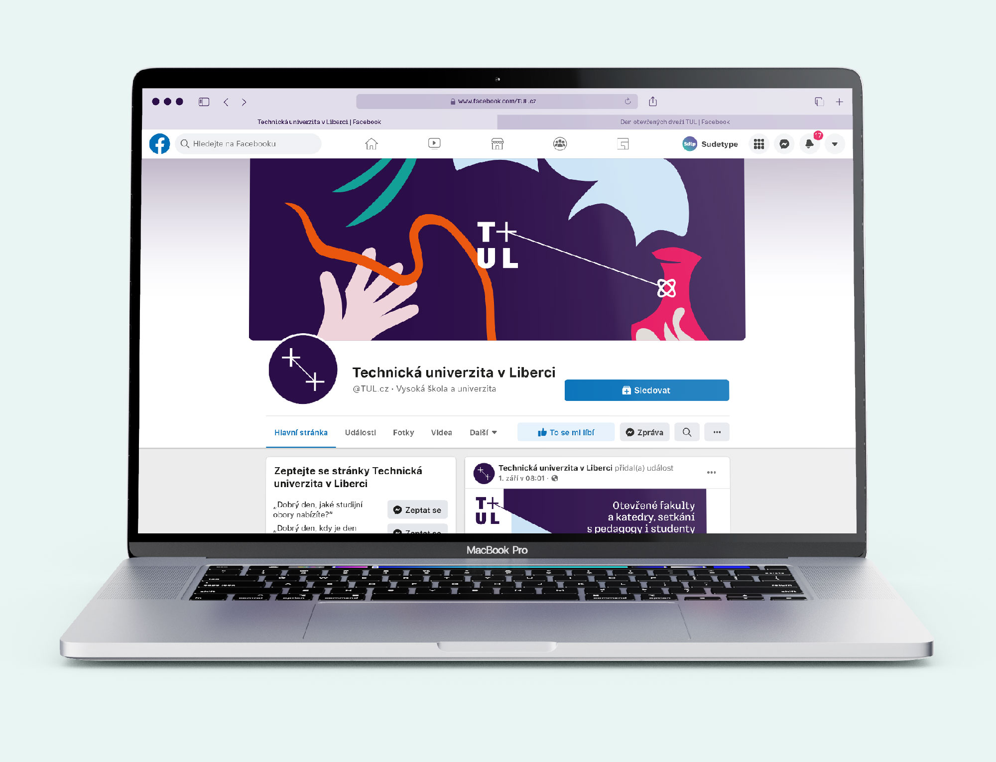
The core idea of our visual style design for TUL is connection. Because connecting partial knowledge and experience and finding new connections is at the heart of every scientific research and creative activity. Connecting is also a leitmotif that runs like a red (in our case dark purple) thread through the entire university environment—connecting people, disciplines, cultures, theory and practice, the humanities and the sciences, or the present and the future.

The simple principle allows us to dynamically change the position of the connected elements, but it remains clearly legible even in the basic, static form of the logo. At the same time, the connection between the brand points creates two planes in space. And just as the serious facade of the university hides a primarily living, teaching-student community, the visual style uses the link to separate the ‘dry’ (typo)graphic part and the ‘living’ visual part.
Faculty identities
From the point of view of the effectiveness of visual communication between the university and the external environment, a single, unified visual identity used by all university units is the most ideal. But the visual identity must also work inwards, helping to organise the flow of information on the university campus itself. The university is a diverse and rich community, and there is a natural tendency to create ‘our own’ islands within it, distinguishable from the others (the disciplinary diversity of TUL certainly contributes to that—despite its name it has long been not only a university of technical orientation). But where to stop this individualization? Should every faculty (and institute) have its own logo? Each department? Every office? The answer depends to a large extent on the more general setup of the university culture. However, based on our long-term experience of the visual style of the University of Hradec Králové, we have decided to support the uniqueness of each faculty (and institute) with its own graphical mark, which can be easily identified by both academic and student community members. These sub-brands, however, always clearly refer to the parent (university) identity. The colours of the individual faculties (and the institute) for the most part respect the already established colour scheme (with the exception of FS and FUA), although the individual shades are slightly modified. Each primary faculty colour is accompanied by a complementary secondary colour.
We would not recommend developing the logotype system to other levels (e.g. departments), however—the result may be perceived positively within the university itself, but from an external perspective it becomes too complicated (after all, even just a simple verbal expression sometimes gives a hard time; we salute the Department of Mathematics and Didactics of Mathematics of the Faculty of Science, Humanities and Education of the Technical University of Liberec).


University as an inspiring environment
Whether it’s an invitation to a public lecture or an introductory slide of a presentation, a high-quality image comes in handy. But it’s not always easy to get one—so what now? Use a low-quality image from a smartphone, an image downloaded from Google, or design the material purely typographically? Our solution: illustrations. In our design, they form a pendant to the deliberately simple (and therefore timeless) system of basic marks. At the same time, they show the university as a modern institution, an environment that is friendly, inspiring and open to experimentation. Fortunately, the days when students were afraid to even knock on the door of the study department are long gone (or so we hope).
In our system, we placed illustrations in the group of elements with the most frequent variation. Updating them regularly keeps the visual style of the university always up-to-date, responding to current topics and technological advances. We have recommended the principle of working closely with a particular illustrator, always for a period of one year. In just a few years, the university could have a rich collection of illustrations for all kinds of uses, yet all tailored to TUL. Despite their diversity, the coherence of the visual identity is ensured by strict respect for the colour palette of faculties.
By the way—the motifs used in our competition design were created by the brilliant Karla Gondeková from the Studio Divize (whom we would like to thank once again, especially for her benevolence of our rather brutal work with them).

Tulka: humanizing technicality
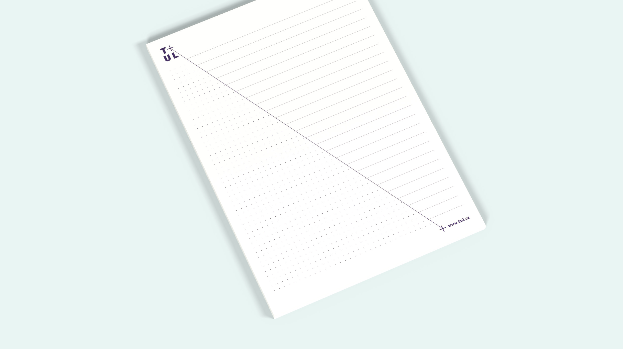
We also designed a brand new typeface for the visual style, familiarly named Tulka. It belongs to the (pseudo)category that we could call ‘semi-mono’. From its inspiration source, i.e. ‘technical’ monospaced typefaces, it takes the serif design of selected letters (I, i, l, r), but for better legibility the width proportions are ‘humanized’, i.e. differentiated. In its character, Tulka shows its more technical roots without appearing too inhuman. The relatively high contrast gives the typesetting a slightly displayish character.
A complementary roman typeface is the open-source Yrsa by Rosetta (Anna Giedryś / David Březina). Selected styles are also available on Google Apps.


Want to share it on social media or on your blog?
Why not! But we will be happy if you let us know.