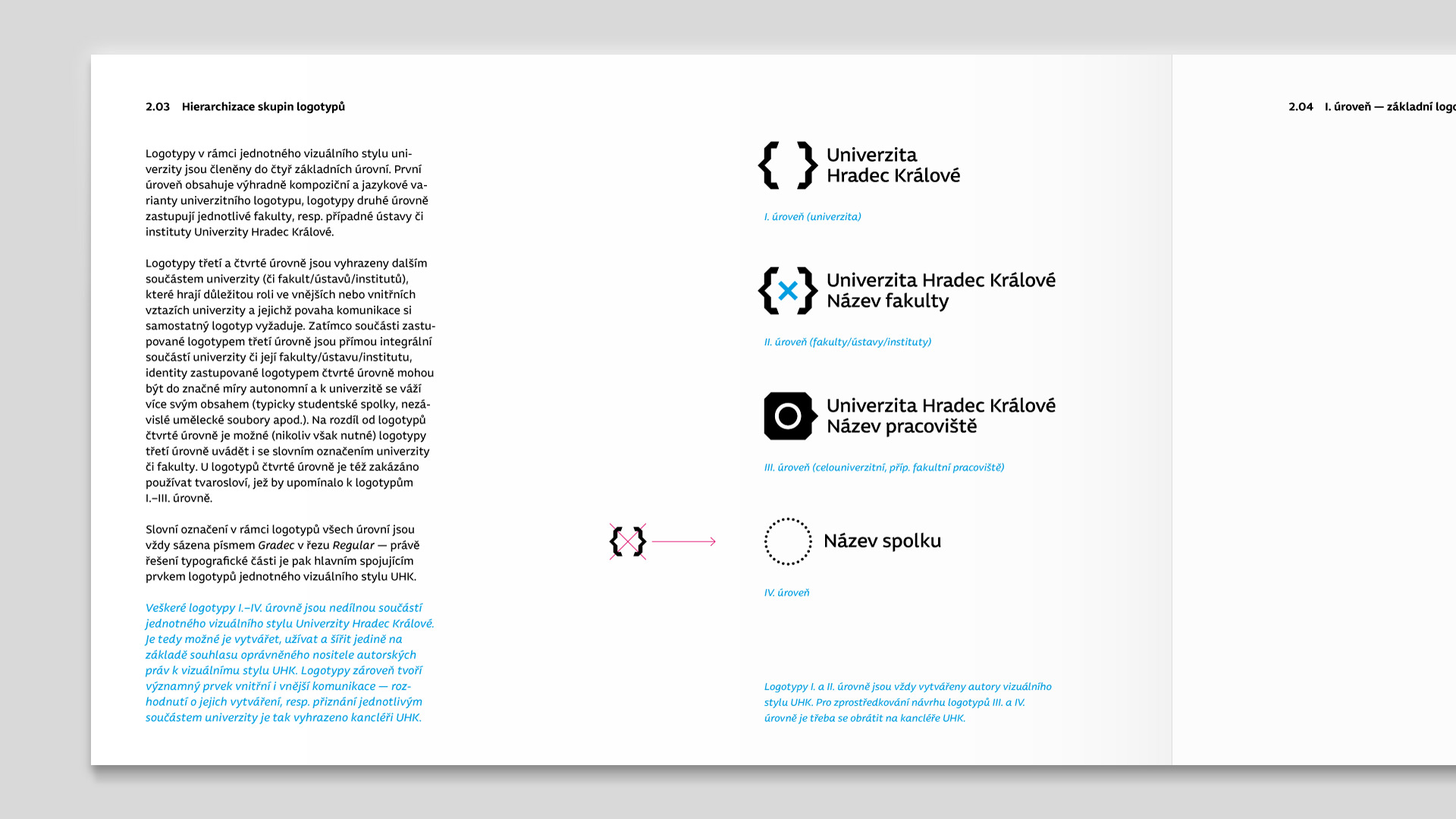

University of Hradec Králové
A set. A set of students, a set of lecturers, a set of faculties, a set of ideas, a set of results, a set of words.
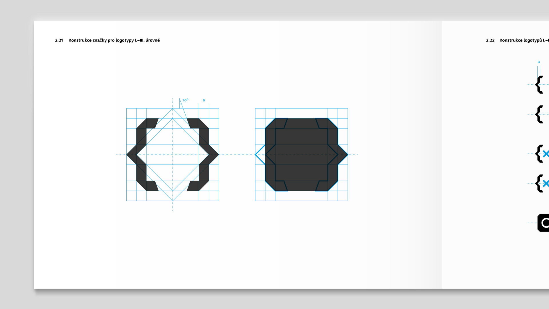
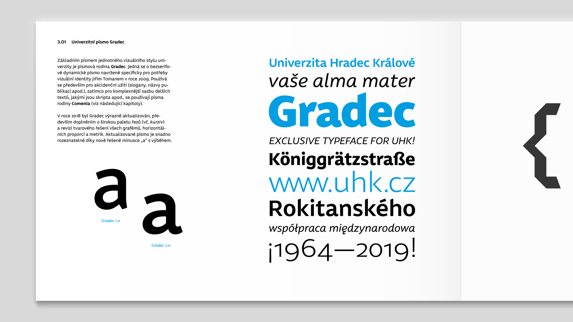
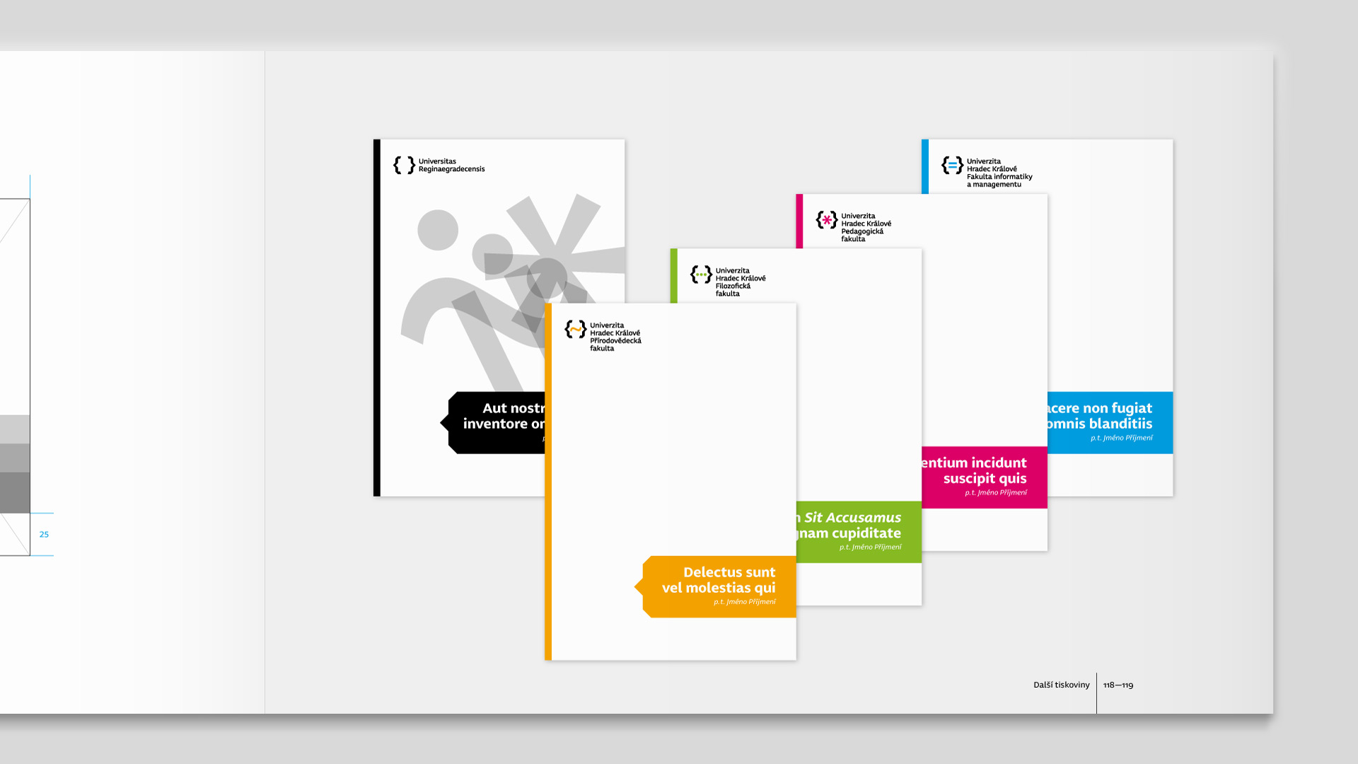
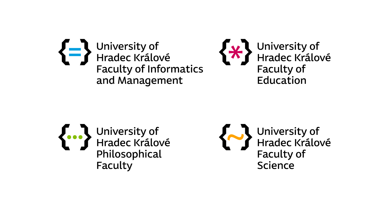
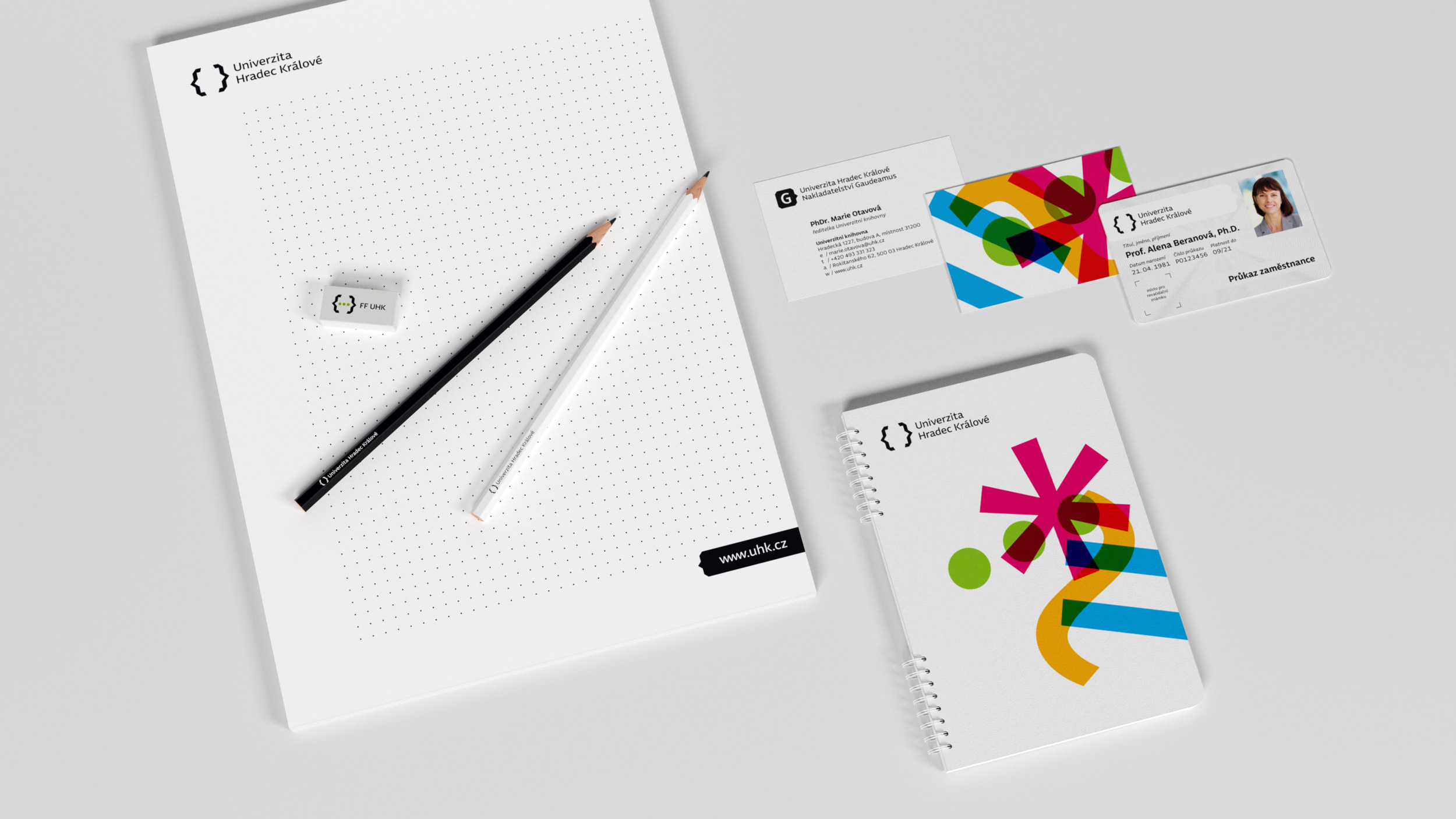
That is the basic idea of the University of Hradec Králové logotype. It unleashes the university as a space open to new dimensions, a space that can freely co-create each of us. At the same time, however, it is a space that protects — just as it once did Hradec fortifications, that (together with an unforgettable reference left in Hradec Králové by Josef Gočár, Oldřich Liska and more) inspired carefully crafted geometric morphology of the graphical symbol. Thanks to its unique (typographic) concept, the university mark remains unchanged with any number of faculties. There is no need to change costly sandblasted glasses, engraved signs or car labels every time you set up a new faculty, notwithstanding the brand awareness as such. Thanks to their consistency, supplementary faculty logos themselves meet all the prerequisites for easy identification of the faculty within the universities as a whole, both in shape and in color. Although each logo allows a full-fledged development of faculty identity, it celarly remains a part of the university identity. For the logotypes and other use within visual style of the UHK, Jiří Toman designed the exclusive typeface Gradec.

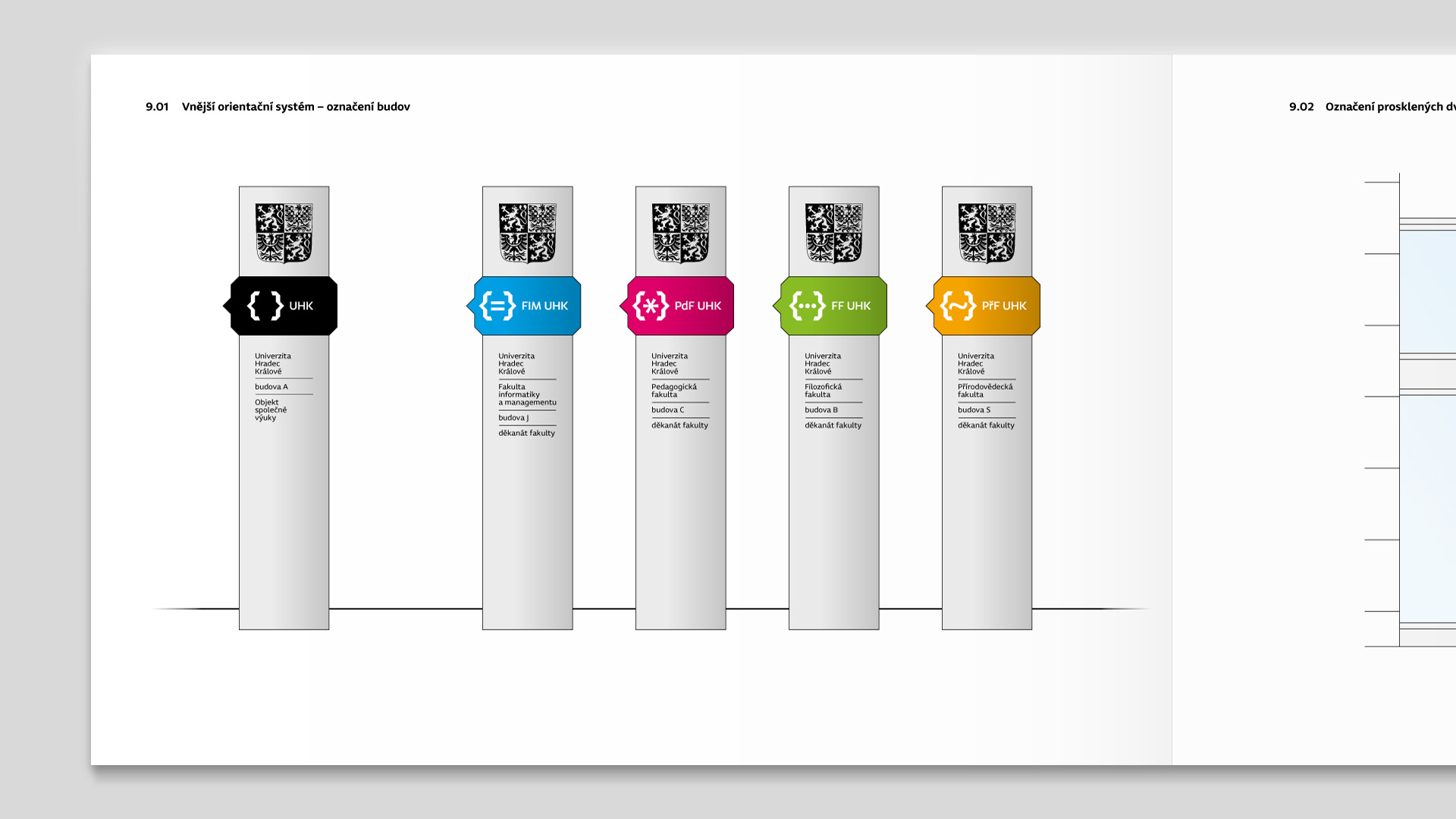
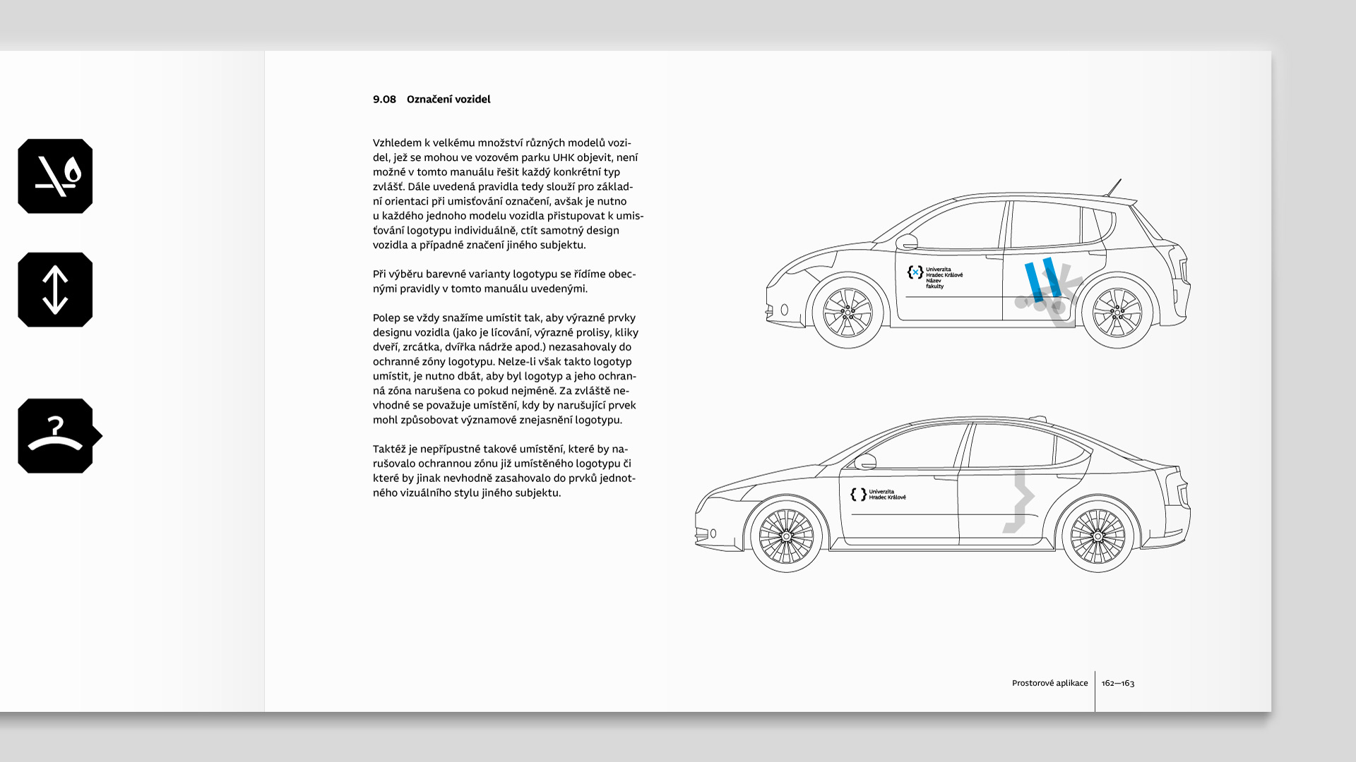
Selected spreads from the second, revised edition of the Graphic Manual of Logotype and Visual Style of the University of Hradec Králové (2018):