Whoop·de·doo
At the beginning there was a student interdisciplinary aid, and a few years later the prestigious Red Dot Design Award. It was the logo-lettering for a set of erotic equipment for women, at the time Anna Marešová’s diploma thesis in the studio of product design at Faculty of Art Design of J. E. Purkyně University, which also started our long-term and multi award-winning cooperation.
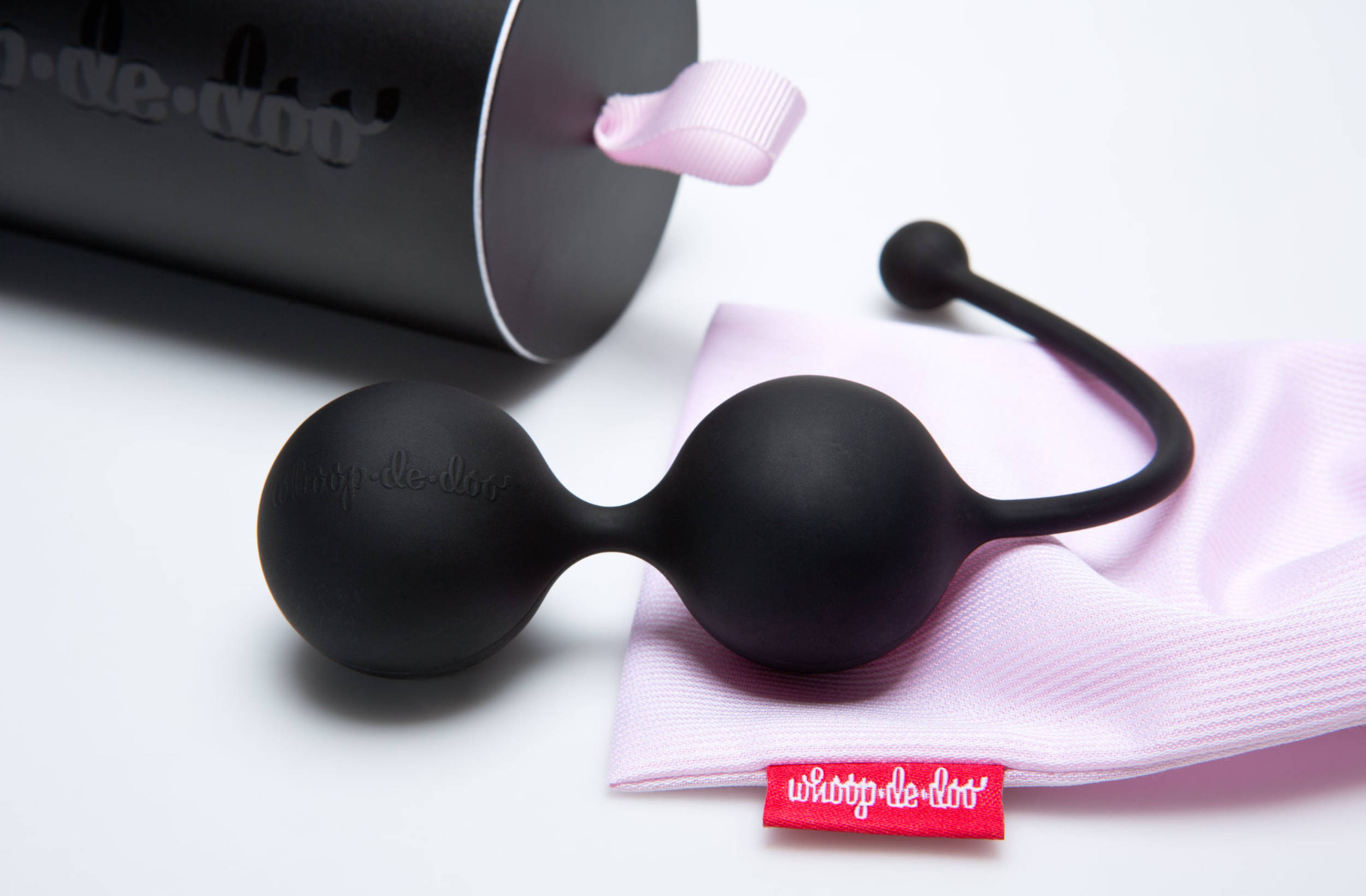
The intimate products by Whoop·de·doo by Anna Marešová designers are full of tenderness and purity. They approach the topic of sexual health with sensitivity. When designing visual identity and packaging, we had a clear goal—to find the right balance between purity, temperance and elegance on the one hand and passion on the other. In its morphology, logo-lettering is based on ‘emotional’ brush calligraphy (with a subtle hint of phallic shape in the letter ‘d’), but it is set into a clean graphic environment, omitting prurient colors or decors.
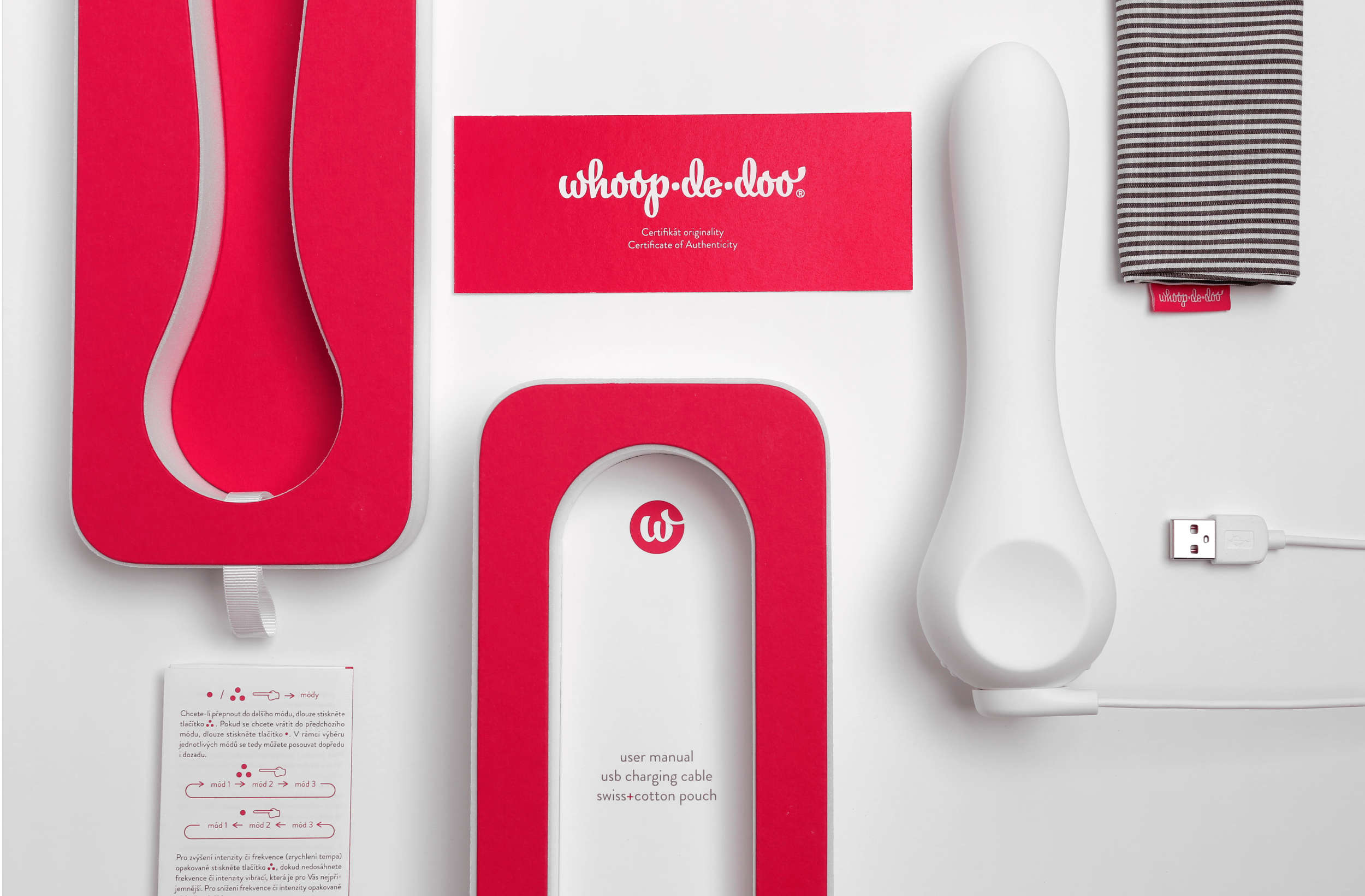
The packaging design respects the basic philosophy of the product line, with an emphasis on the quality of materials and printing processes and careful execution of even the smallest detail.
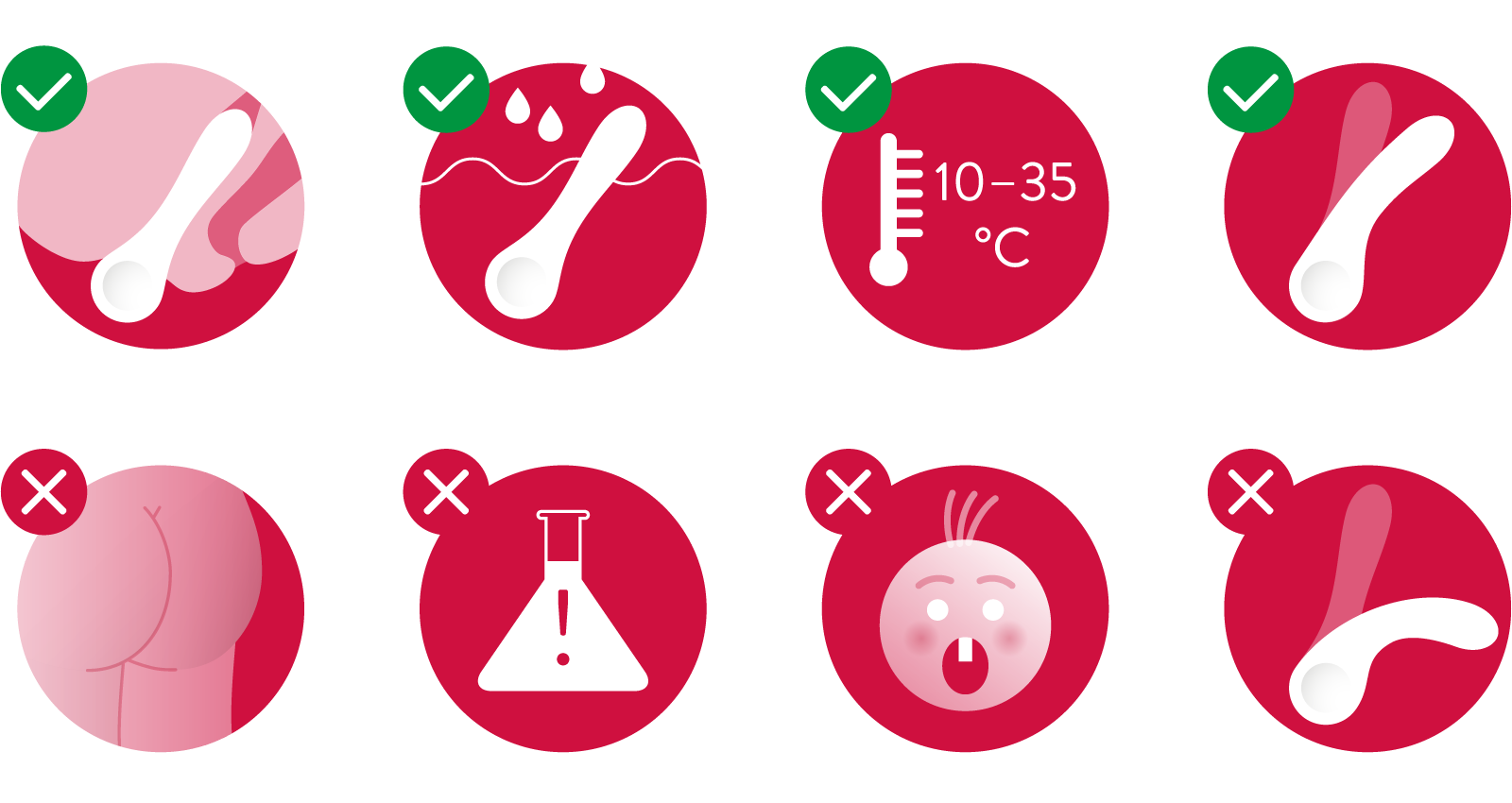
How often does the designer get a chance to design the buttocks pictogram? Honestly, we have no idea, but we were lucky to get one. The illustrative character of the pictograms corresponds to the context of their usage—within instructions for use of product, created for physical pleasure and relaxation.
During the development of the products themselves, we have worked together to solve partial details, such as the haptic user interface of the control buttons, based on the proven principles of accessible design for the blind and partially sighted.
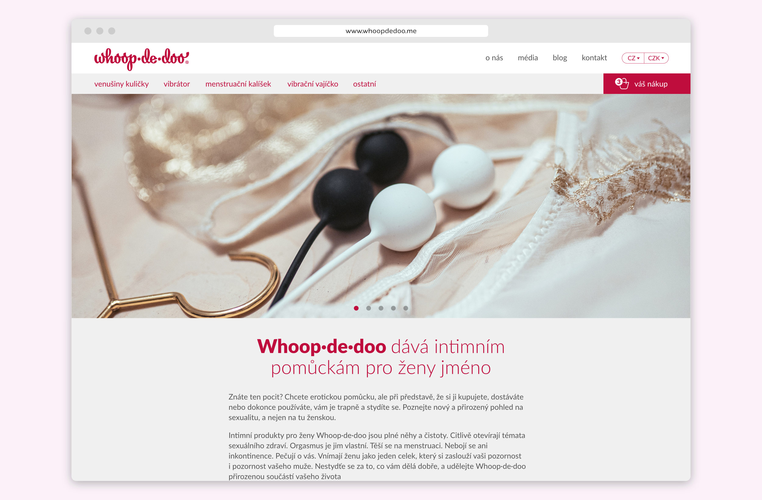
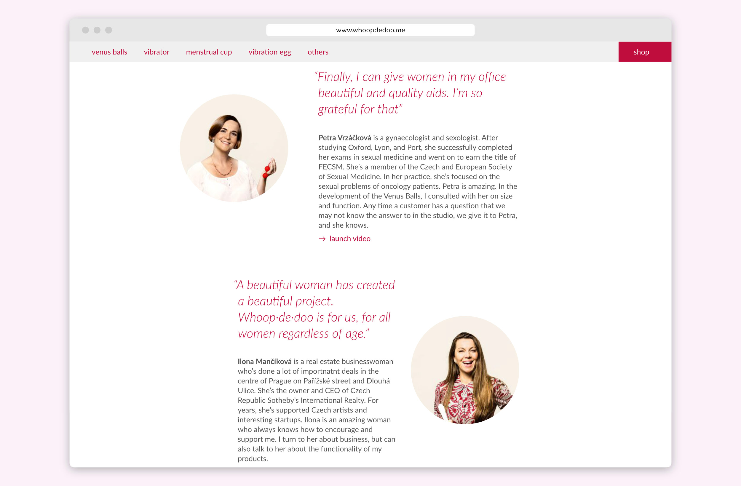
In 2019, the whoopdedoo.me website was also redesigned. The emphasis was on graphic clarity and user-friendliness, following the Whoop·de·doo spirit.
The Whoop·de·doo product line—and its chief designer Anna Marešová—have won numerous awards. We are really proud to be a part of Whoop·de·doo. Thanks Anna!