Otevřeno
The brief was simple: to update the visual identity, but keep the logo, font and colour. So we took on the task of updating the visual style and changed… the logo, font and colour tone (but only in a way that didn’t break the continuity of the brand identity perception, obviously). A key part of the update became, perhaps unsurprisingly, openness (Otevřeno stands for ‘Open’ in Czech).

The original logo (designed by Tomáš Čakloš) was based on a combination of the graphic mark (icon) of an open book and a name of the association. The open book naturally refers to education, but it is also a graphic expression of the name. The open book motif corresponds perfectly with both the name and the values of Otevřeno—it has become its established brand. In the wider context of graphic design, however, the book is a frequently used symbol and it is virtually impossible to achieve clear distinctiveness (while maintaining the clarity of the symbol) by just styling it.

But how necessary is it really to have a unique and easily distinguishable graphic brand? In fact, this is just one of many possible strategies, and there are many (successful) brands that do not use a graphic symbol at all. More important for successful visual communication is the interdependence and coherence of the individual elements that make up the visual style and their adaptation to the real needs of the user.
Basis for the update
Continuity: the existing logo, colour scheme and basic brand communication principles are established and positively received. It is therefore desirable that the update of the visual style maintains the continuity of the perception of the association’s identity (i.e. evolution, not revolution).
Openness: the work with the visual style should be open, i.e. on the one hand, it should allow for continuous addition of new motifs and adaptation to current needs, and on the other hand, it should be as accessible as possible to content creators (easily accessible resources, open source fonts). The visual presentation should also be open (friendly, inspiring) towards the recipients.
Functionality: the visual style should be adapted to the specific needs of the recipient—e.g. adapting the styling and size ranges of the logo to the digital environment.
Updating the visual style
Alignment to the grid is based on the defined minimum size of the logo and, by adhering to the recommended size table, ensures better legibility on screens.

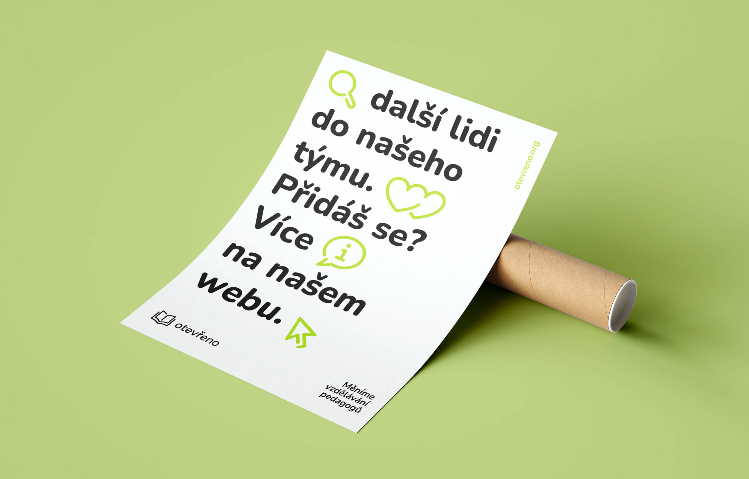
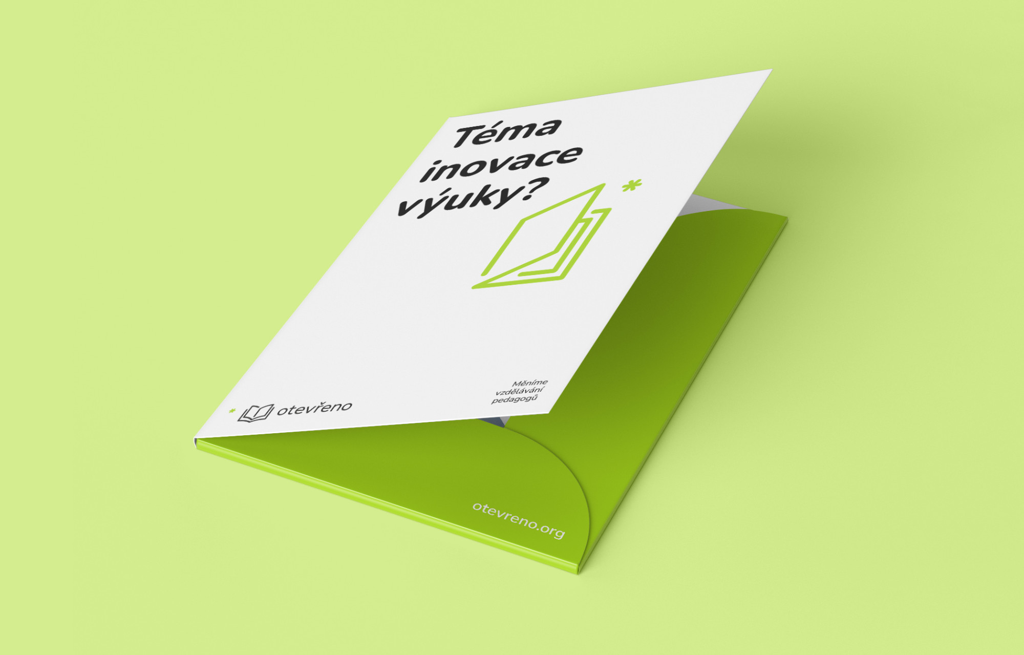
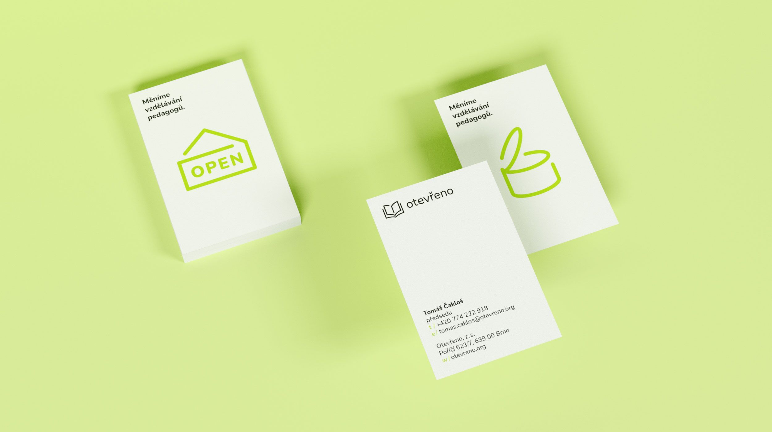
The additional icons, with their open monolinear drawing, are related to the basic mark and thus form a coherent set of communication elements. The rounded strokes fully correspond to the morphology of the open source font Nunito.

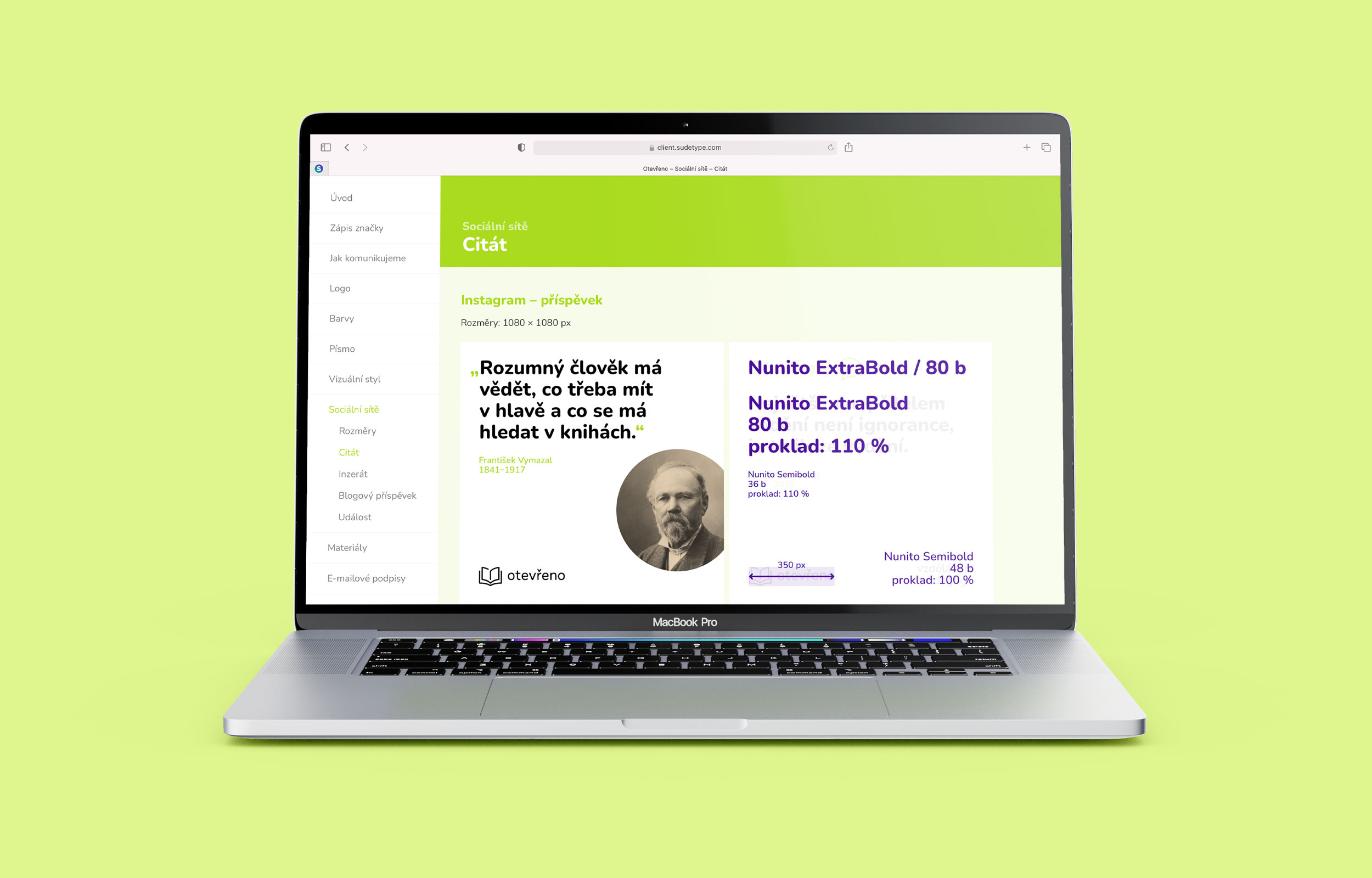
The new font follows the soft and friendly character of the previously used Capriola font, but at the same time has a wide range of styles, from ExtraLight to Black, including Italics. The font is distributed under the Open Font license, including Google Fonts, and is thus available in all Google Workspace apps.

The woodmark is based on the existing Regular weight of Nunito typeface, but all letters have been completely redrawn. The contrast of the strokes has been reduced to a minimum (while maintaining the necessary optical corrections) and the typeface now has an almost monolinear appereance that better corresponds to the brand. The rounding of the strokes is now strictly geometric—again in line with the morphology of the other elements of the visual style of Otevřeno. Through a combination of choosing the right initial style, adjusting the size ratio of the graphic and type elements of the logo, and minor corrections to the lettershapes, the main strokes of the woodmark now have the same thickness as the line thickness in the open book symbol.
