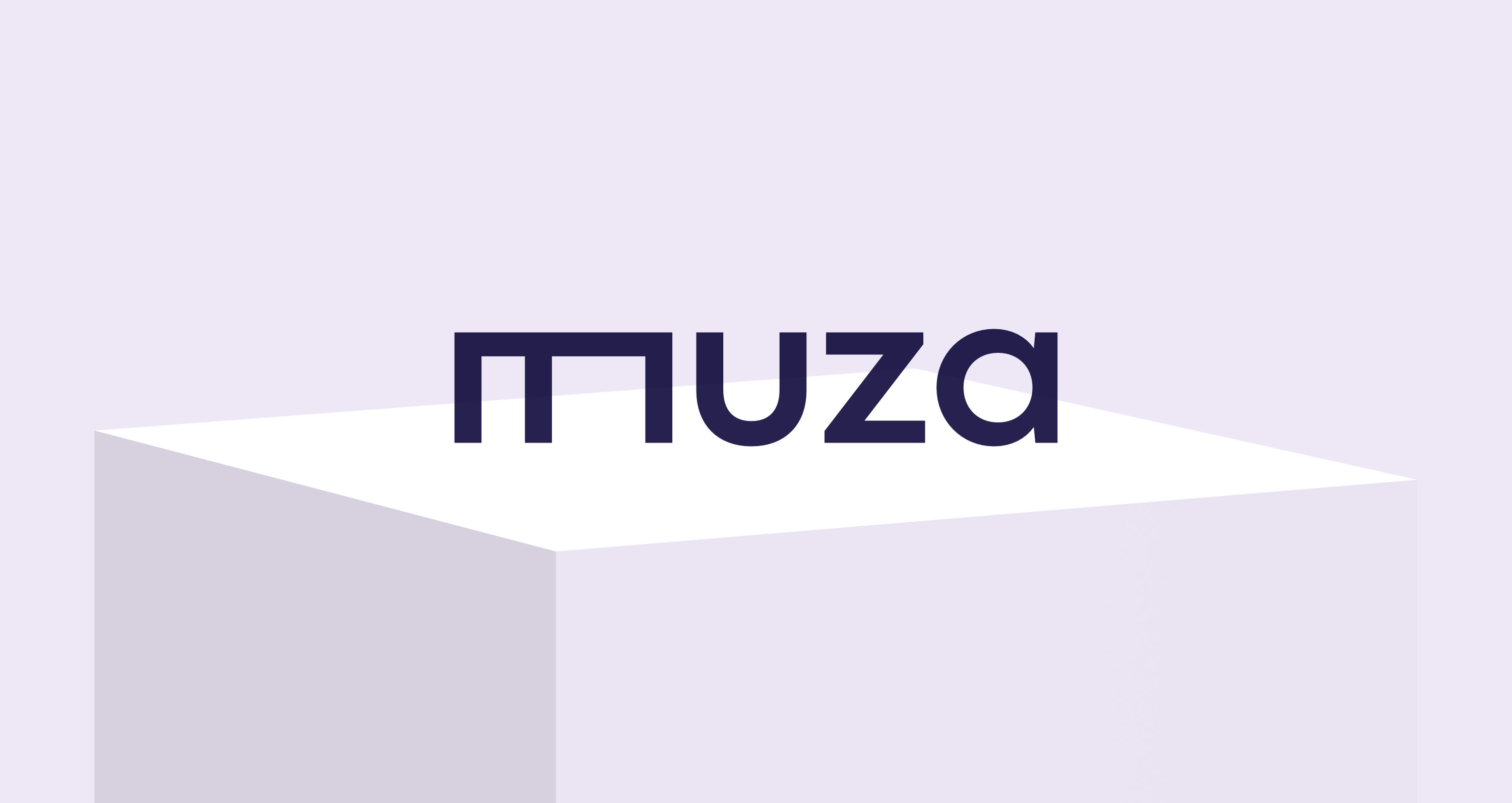
MUZA
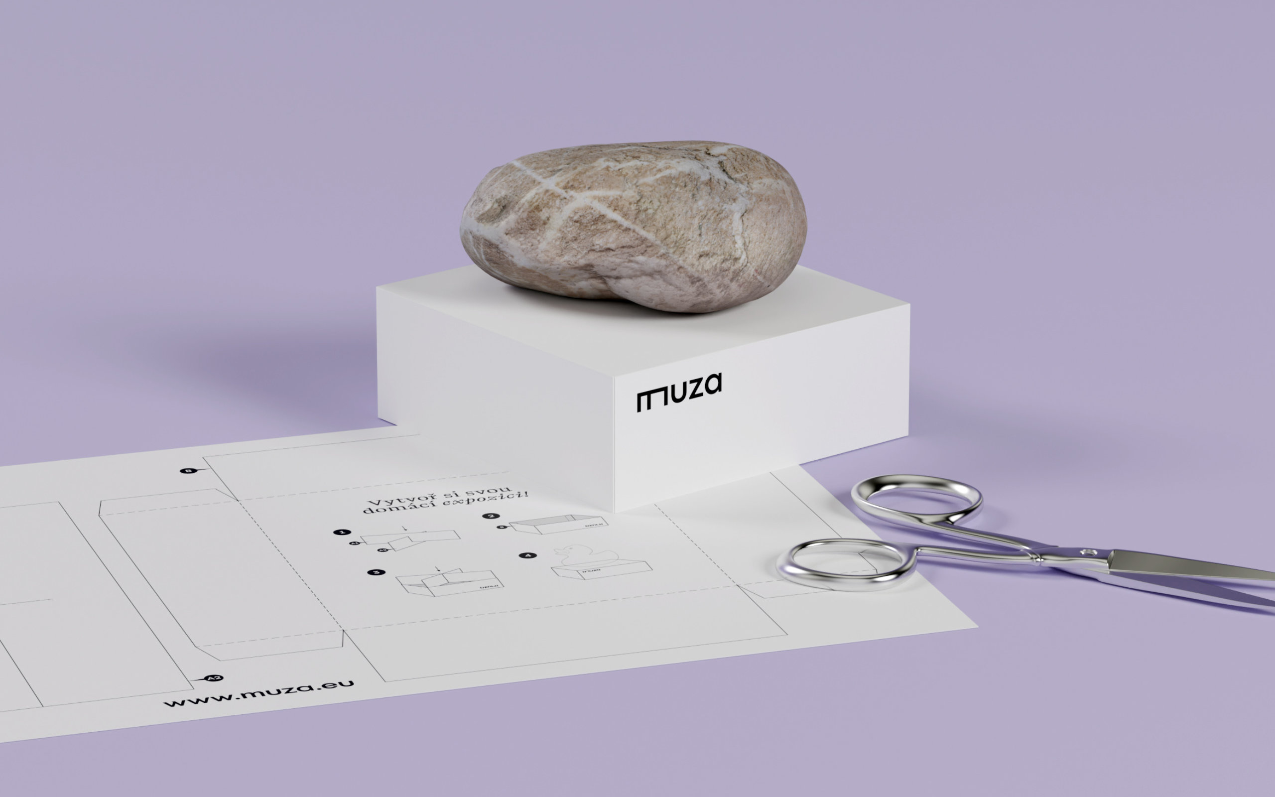
A glass on the table. A common object. We pass by, almost without noticing. But what happens if it is placed on a plinth? We are shy to even touch it without white gloves, we focus on every of its curves, we study the refractions of light with fascination, we don’t even think of trying to drink from it. It turned into an exhibit.
And this is the case with a large part of the museum’s collection items — previously everyday items are now admired exhibits, once abundant animal and plant species are now, unfortunately, often becoming museum rarities. Even with objects that have been unique and exceptional since their creation, the act of exhibiting (or not exhibiting) and its context reflects current societal values and how we relate to our own history.
And it was this act of exhibition that became the main idea of MUZA’s visual identity (officially known as the North Bohemian Museum in Liberec). The stylized plinth is present not only in the logotype itself, but above all as a basic ideological and compositional principle, unifying all elements of the visual identity, giving them a clear order and internal logic.
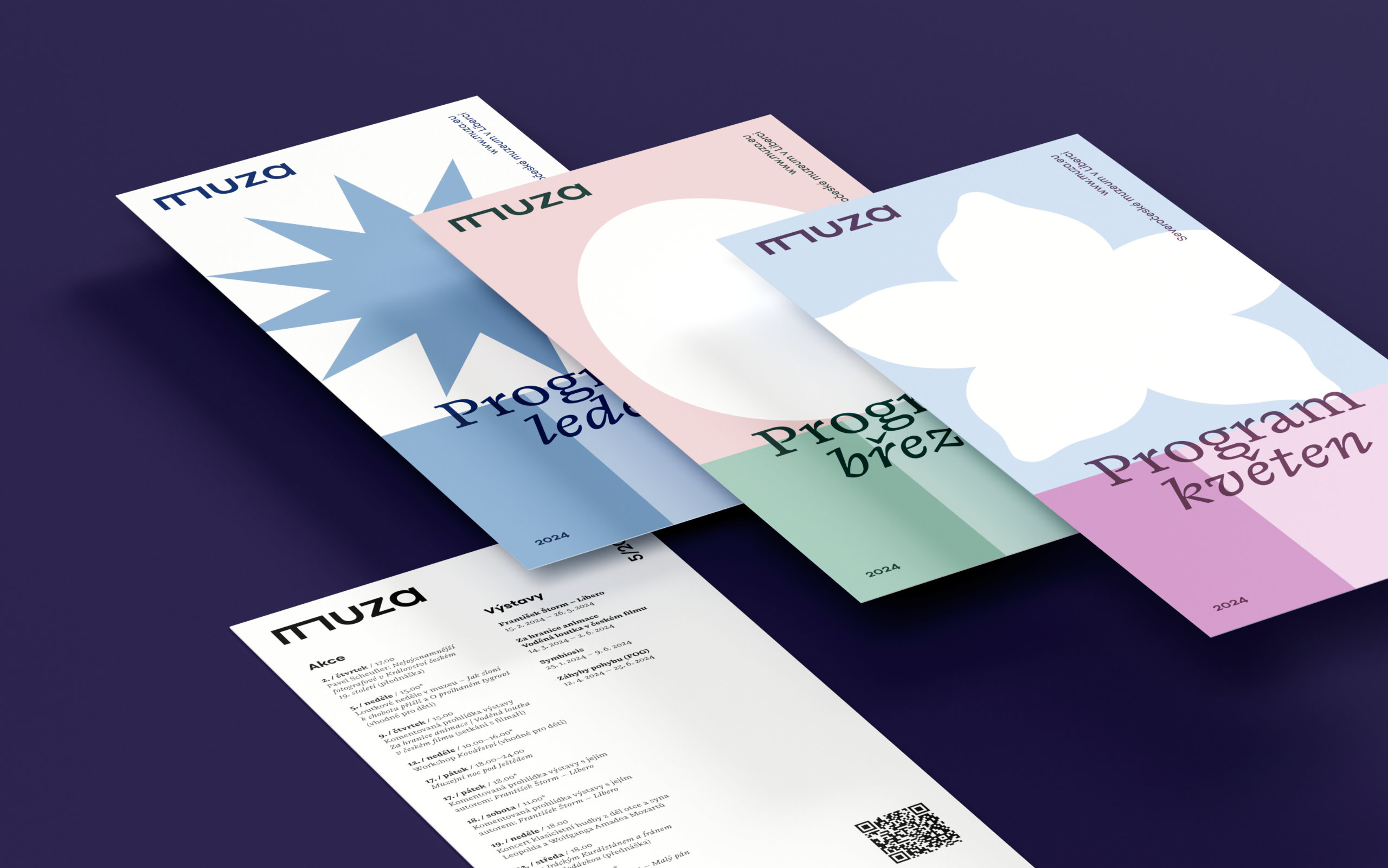
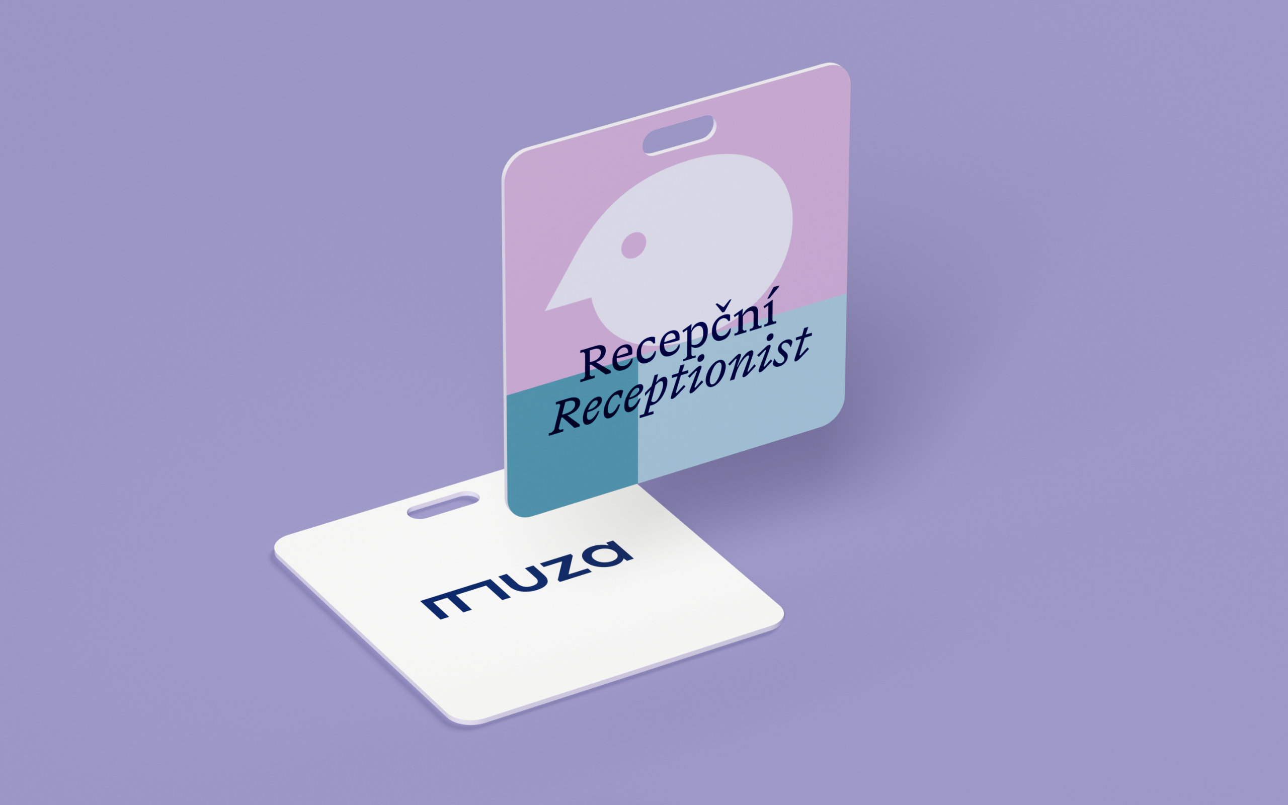
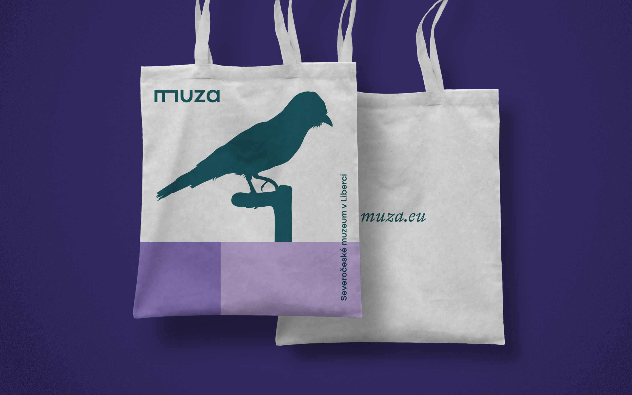
The plinth motif is worked on three levels in the visual identity: typographic, graphic and three-dimensional. In its typographic, most stylized form, the motif is applied primarily in the logotype itself. The second level is the graphic rendering of the plinth using colored surfaces with defined color and contrast. This enables a clear formal unification of all printed materials without, however, the plinth motif drowning out the communicated content itself. In the third level, i.e. three-dimensional, the plinth naturally blends into the museum space, but it is also present on promotional items and social networks.
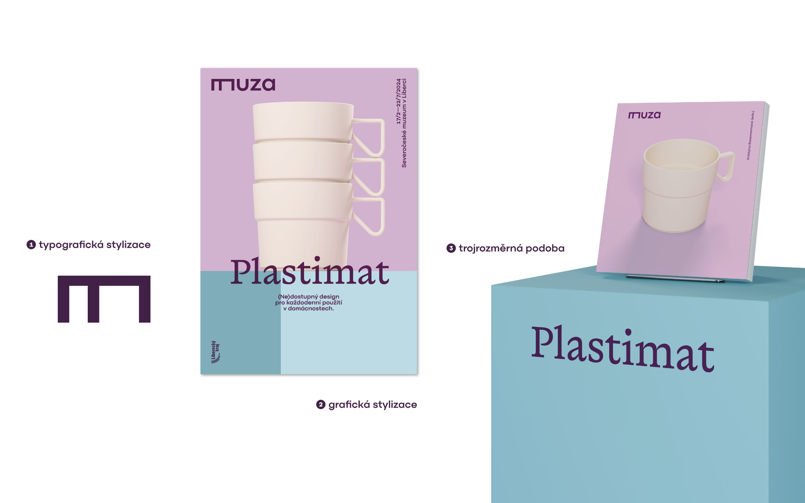
Although the logotype is monochromatic in its basic variant, the visual identity features rich, but carefully selected color palette, presenting the museum not as a ‘petrified’ institution, but as a living organism, a place rich in activities for all age categories, both for experts and general public. The wide color palette also makes it possible to react flexibly to the tonality of the image elements (photos) and adapt the materials to the given themes — from more vivid combinations for creative workshops, for example, to a moderate monochromatic palette where any joviality is out of place in relation to the theme.
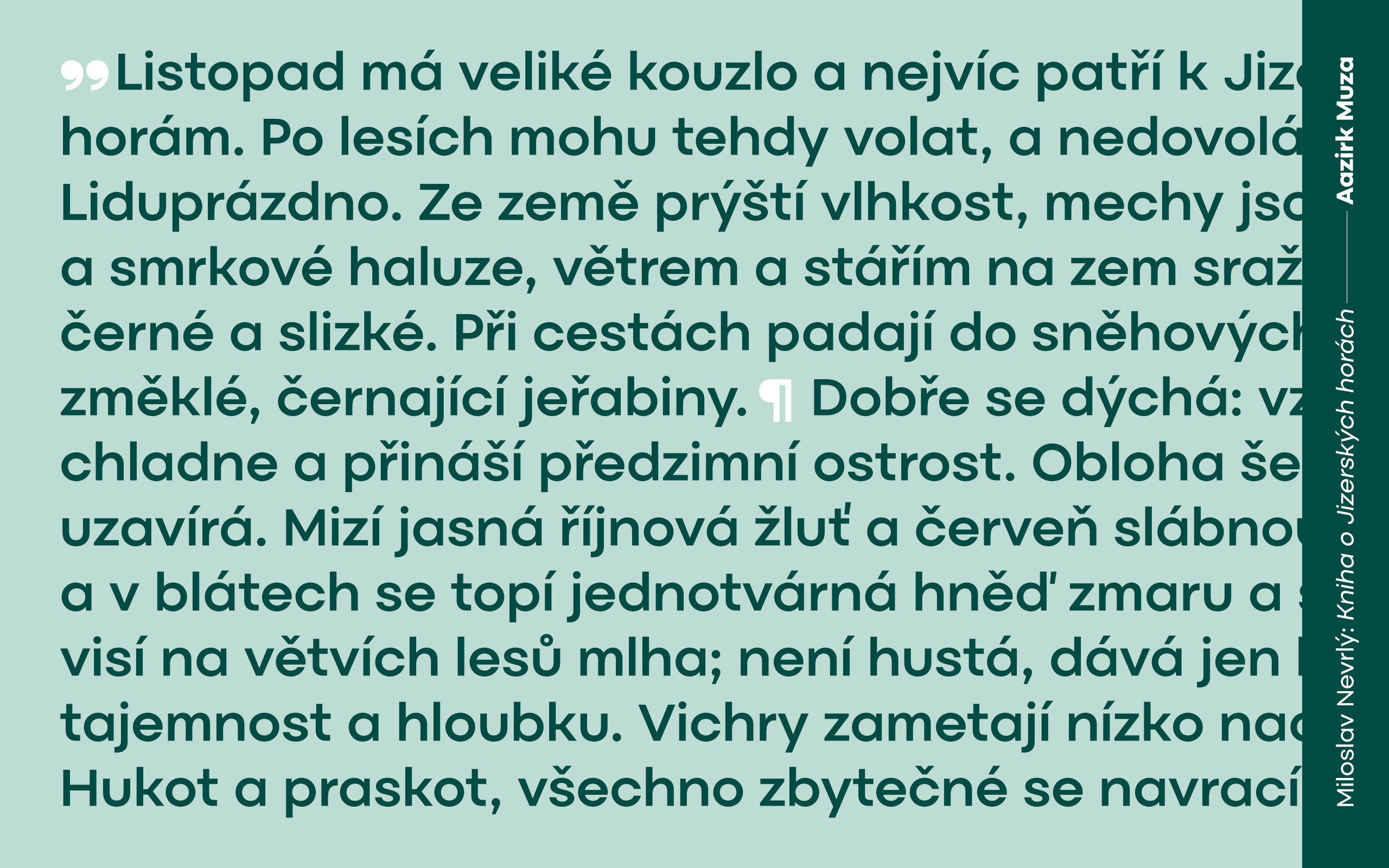
In the visual identity of MUZA, our typeface Aazirk Muza fulfills the role of a timeless neutral counterpoint to the striking antique Rapida by Michelangelo Nigra (Typotheque) . With its basic proportions, Rapida draws on Renaissance patterns (which makes it, among other things, perfectly legible in longer texts and in smaller sizes), but almost mechanical approach to its drawing details firmly anchores the typeface in the present and gives it a fresh uniqueness when used in headlines — especially when combined with its italics. The expressiveness of the typeface enables safe recognition of the museum identity even where it is not possible to apply other graphic elements.

The new visual identity of the North Bohemian Museum in Liberec emerged from a design competition organized by a professional organization Czechdesign. The competition was closed, two-phase, non-anonymous, more than 40 graphic designers and studios expressed their interest in participating by sending their portfolios.
