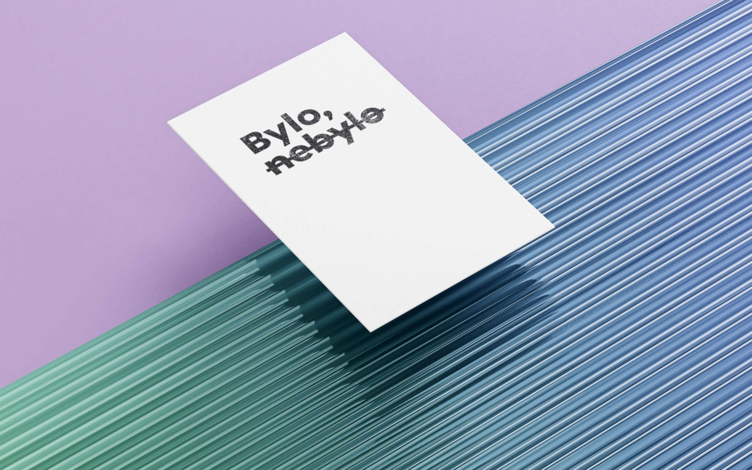
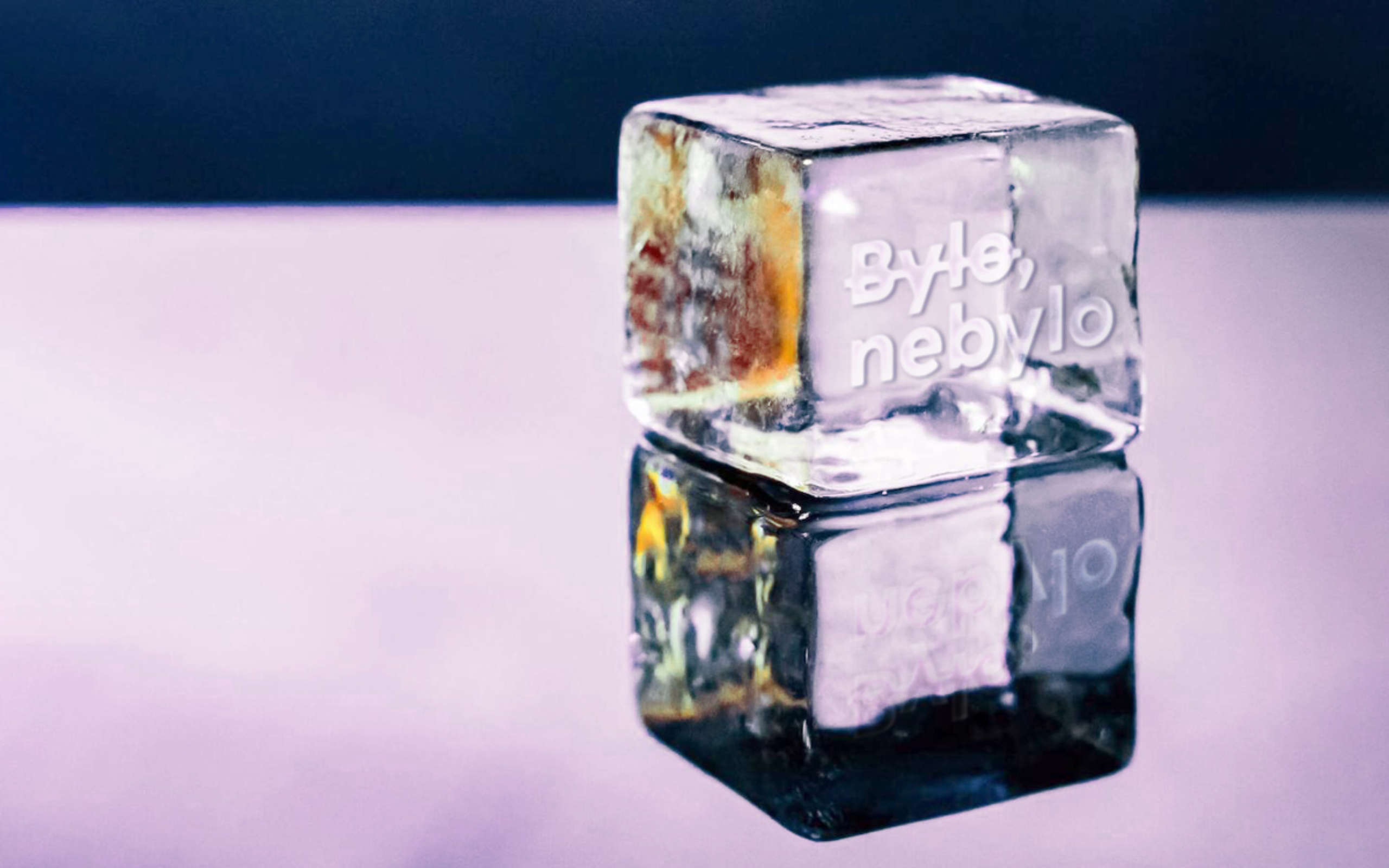
Bylo, nebylo
The traditional introduction of Czech fairy tales became not only the name of the cafe and cocktail bar, but also the basic idea of the entire visual style. The name ‘Bylo, nebylo’ (an accurate translation would be ‘there was, there was not’ but it is used where we would put ‘Once upon a time’ in English) is deliberately confusing the reader/viewer. So was it or wasn’t it? Do they have coffee or cocktails? Or both? Or both? And if it isn’t was, does it mean that it wasn’t, was, or wasn’t? Well — once upon a time, there was Bylo, nebylo.
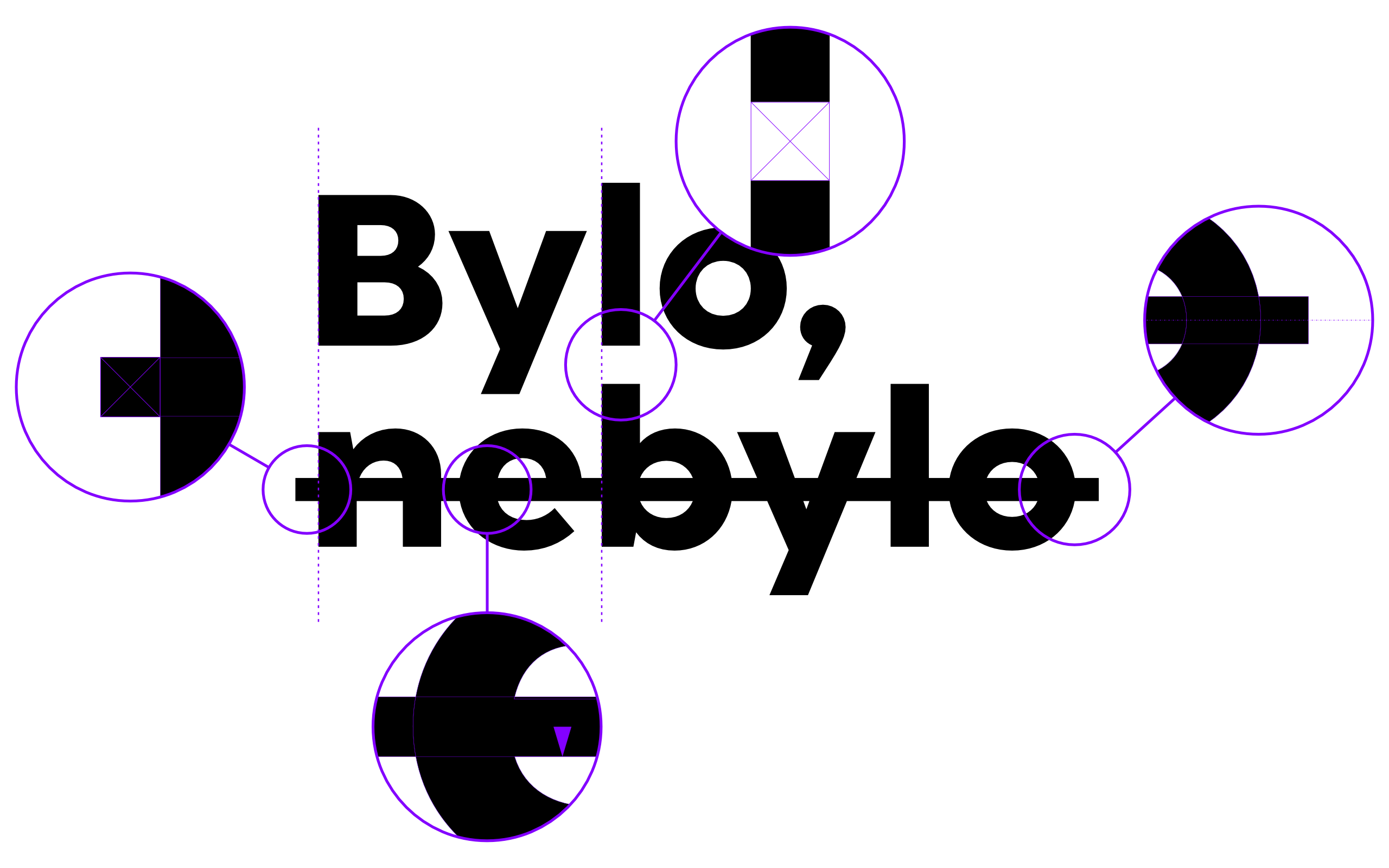
The main idea is expressed in the visual style by a precisely defined strikeout of a part of the logotype, set from our Bezirk typeface in the Bold. The strikethrough is vertically aligned to the center of the lowercase and its thickness is chosen so that it completely covers the crossbar of the lowercase ‘e’ and it protrudes at the edges by a distance corresponding to the thickness of the strikethrough.