Design Pop-up Liberec
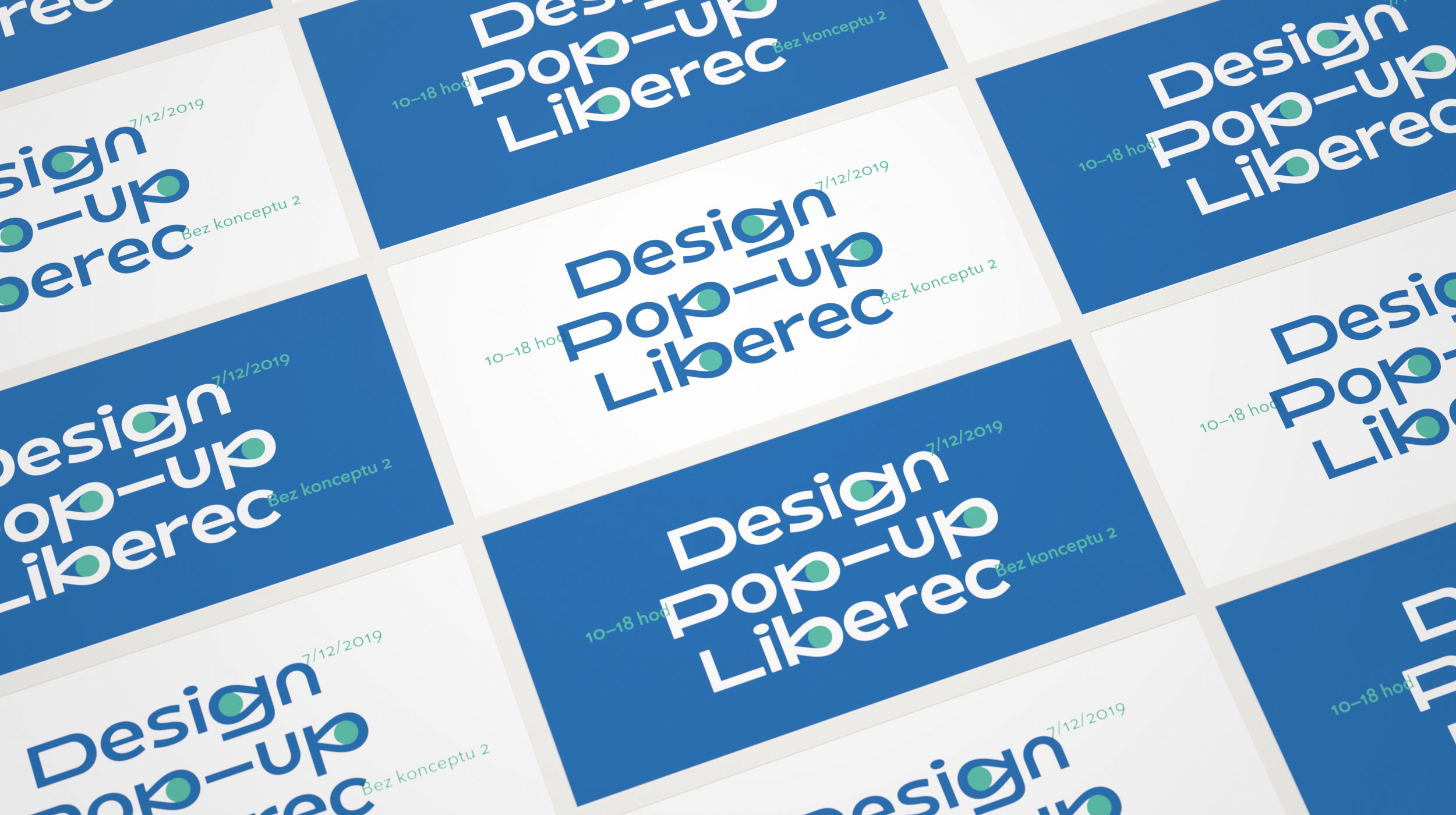
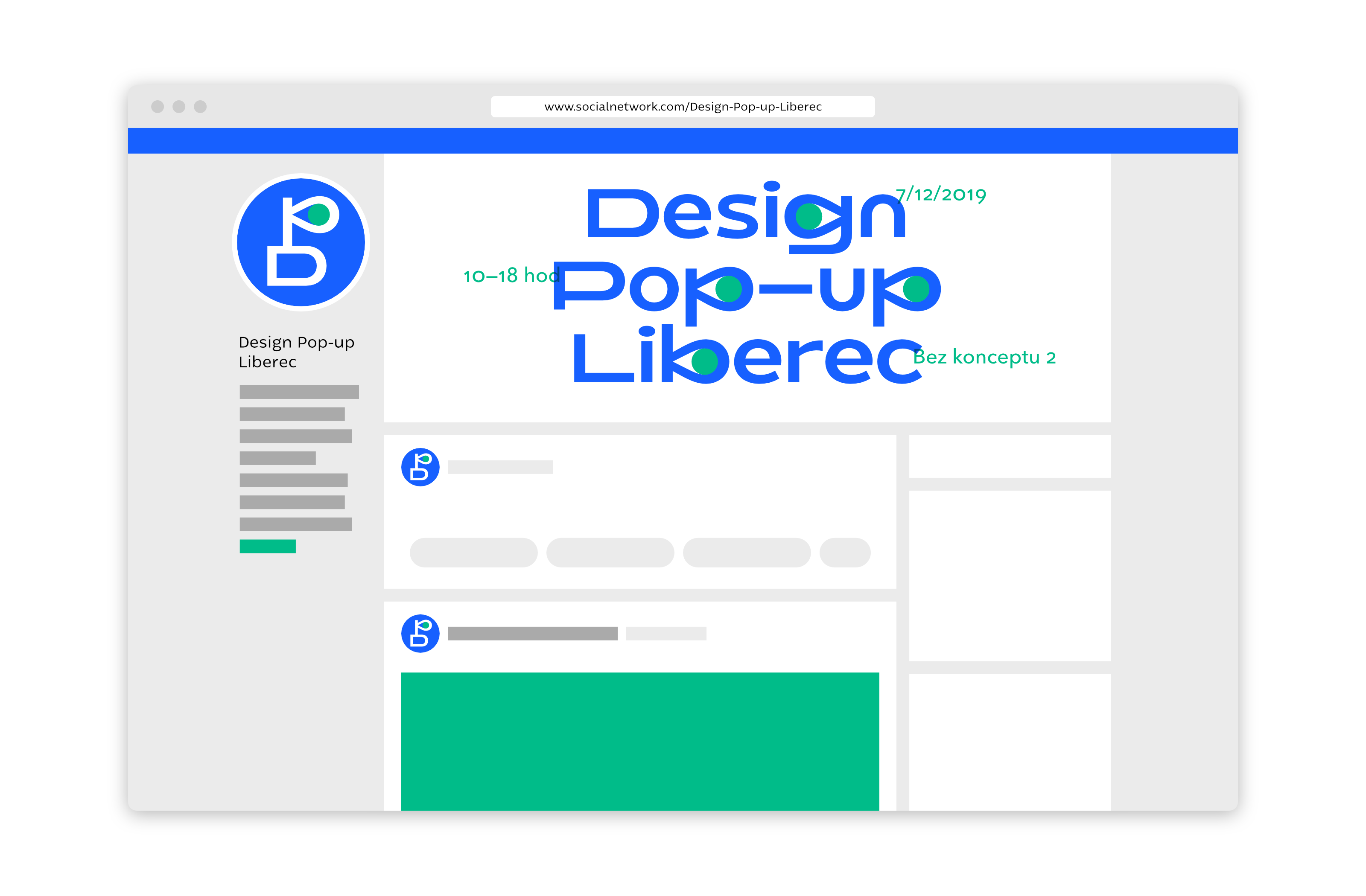
In the popular Liberec café Bez conceptu 2 the curatorial selection of exceptional design associated with northern Bohemia was presented in a form of one-day pop-up store. We have gladly created its basic set of visual identity, especially for communication on social networks.
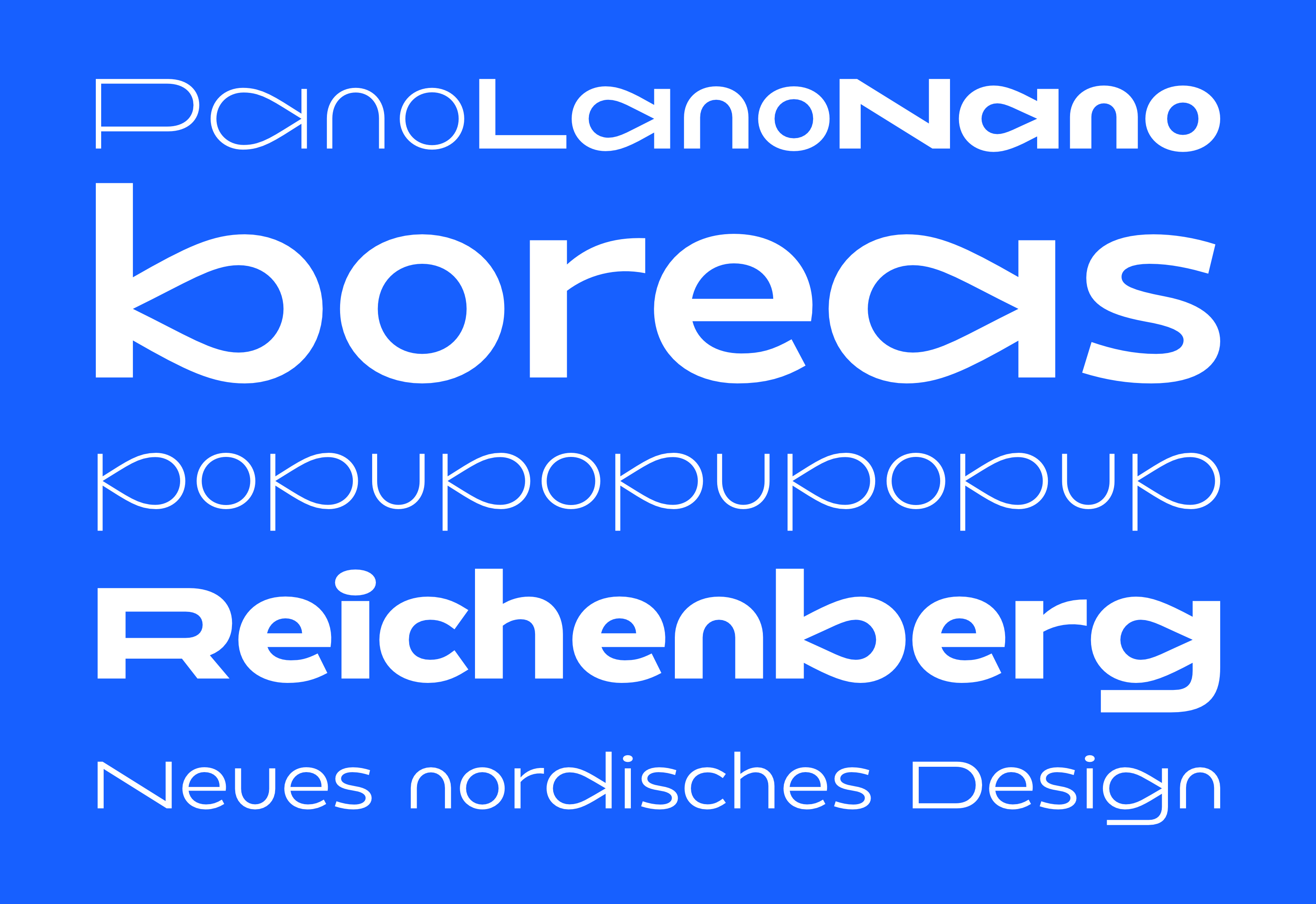
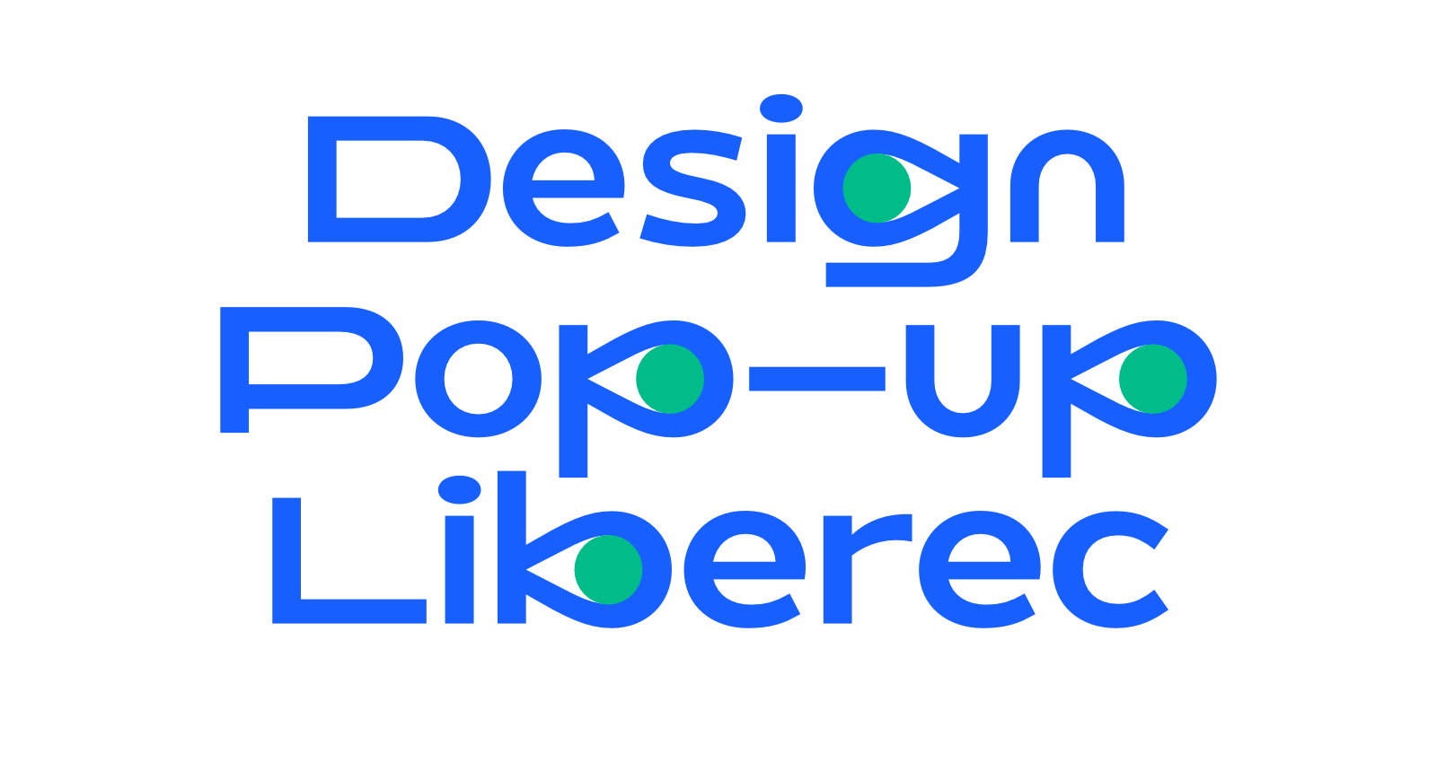
The identity is based on our own typeface, which translates the idea of ‘filling’ the space into typographic language—the counters of a, b, d, g, p, and q are inflated by design products literally to burst. Along with the wide proportions of uppercase letters, the font creates a playful type setting without slipping into inappropriate infantility. A purely typographic identity solution can be easily combined on social medias with pictures of products presented in the pop-up store, while allowing organizers to further develop the identity for other thematic pop-up stores as well.


