Vlkov
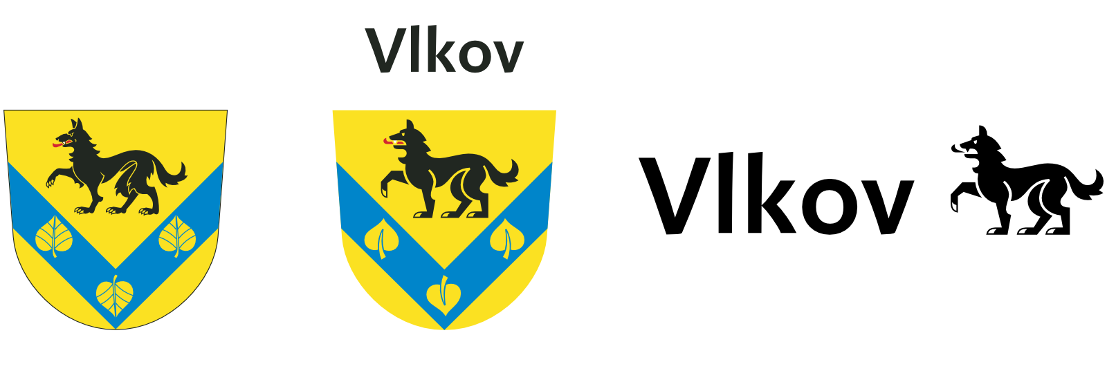
The visual style of Vlkov village is based on a delicate redesign of the existing coat of arms of the village so that it could function not only in its heraldic sense, but also as a brand mark estabilishing a modern visual style.
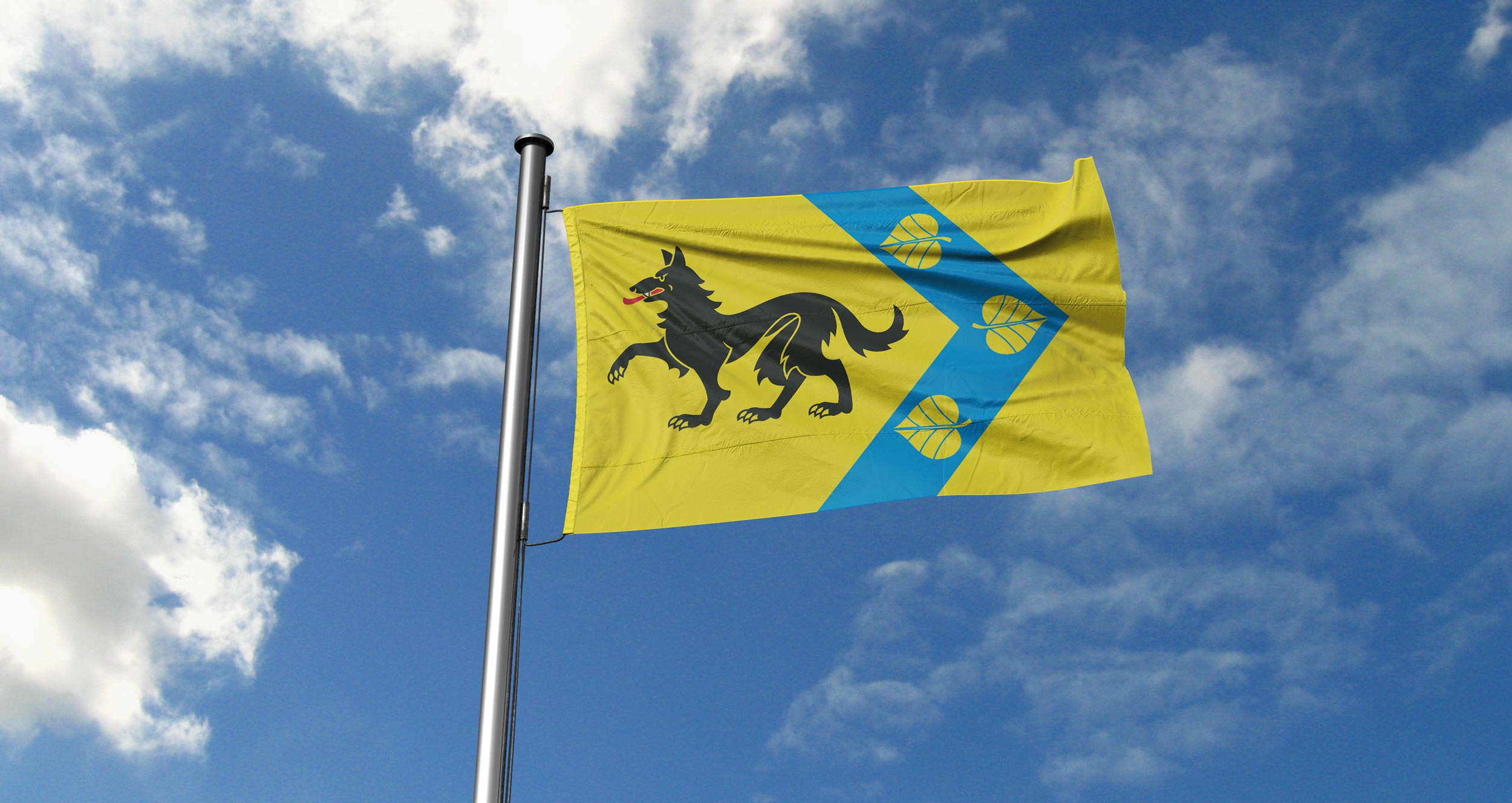
For smaller municipalities with a limited visual style applications, there may not always be a reason for creating a unique brand (logotype) alongside an existing municipal emblem, which the inhabitants of the municipality often identify with. Especially if its blason is directly connected with the name of the village, as it is at Vlkov (vlk means wolf in Czech):
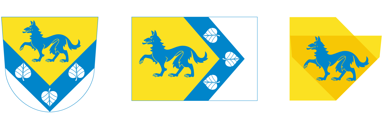
A golden shield with a blue inverted rafter perched with three golden linden leaves, two pointing to the head and the middle to the heel of the shield. The blue chevron, with its tip, draws into the heel of the shield. At the top of the gable above the rafters a black walking wolf with silver teeth and a red tongue.
The original coat of arms (and flag) design, however, despite its indisputable artistic quality, was problematic for two reasons—the detail of the design did not allow a reasonable reduction for the needs of application in the visual style, second, the wolf color was (especially in some applications) more grey than black. We have designed three new variants with respect to different uses: a series of ‘optical sizes’ was created, in which the degree of detail increases with its relative size.
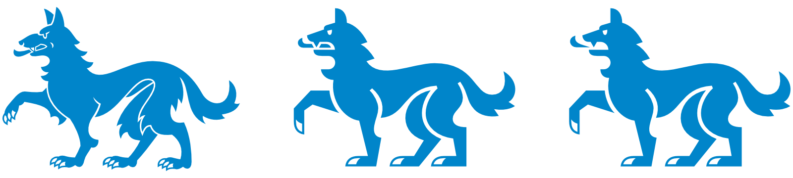
The coat of arms redesign completely respects the blason, but accentuates the anatomy of Canis carnivores. The position of the limbs and tail is adapted to make best use of the space defined in the emblem and the flag of Vlkov village. The updated wolf design allows the use of saturated black. The typical heart shape of linden leaves was also emphasized.
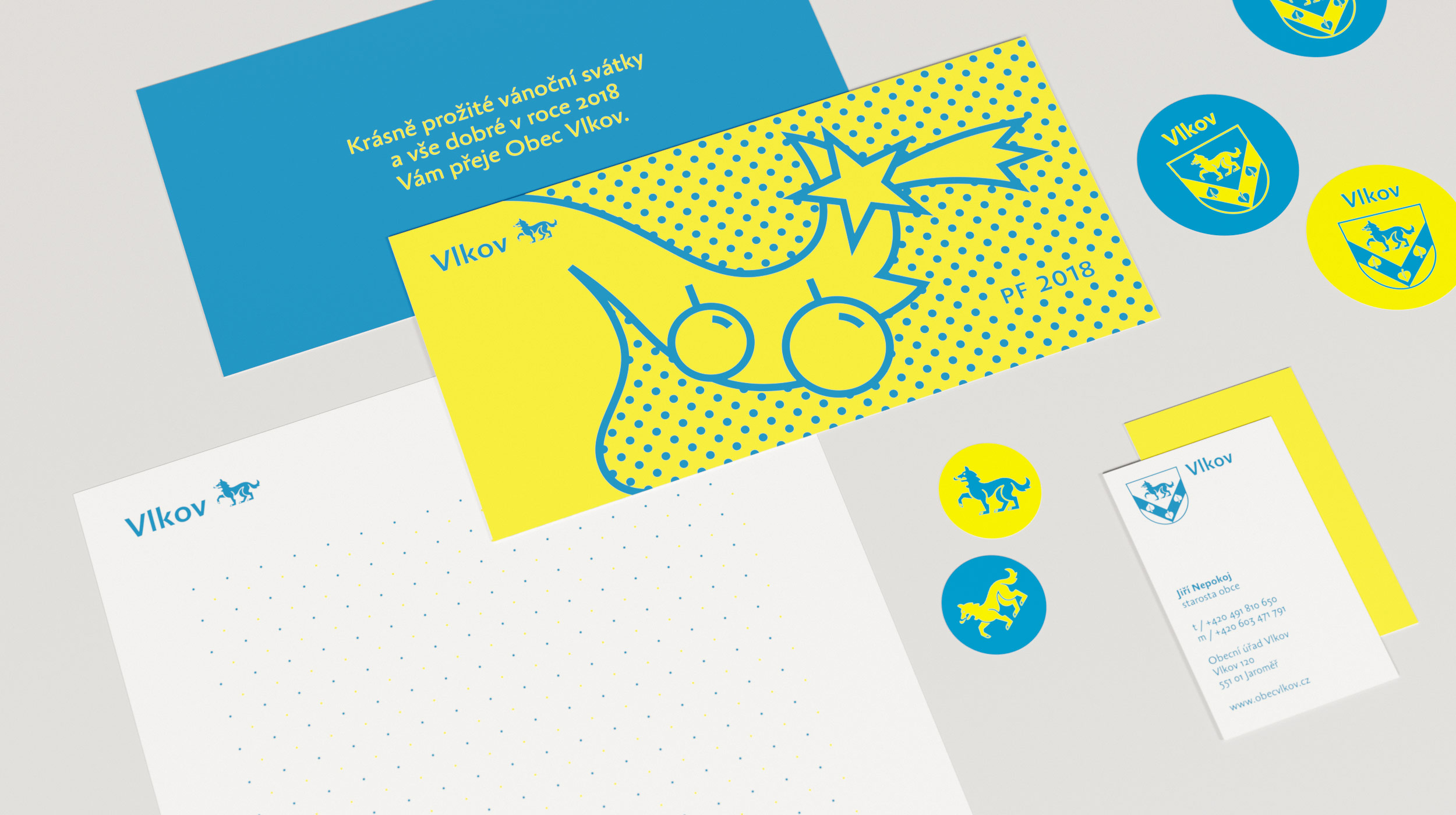
The logo of the Vlkov village is created by redrawing the coat of arms for smaller optical sizes (simplified drawing of the emblem) with supplemented typography. Simplification of the design of individual elements allows their use even in small sizes, without compromising the uniform perception of the symbols of the village. Only simplified version of the emblem is used as a logo though, never the flag.
For spatially limited use or application of less formal character, the wolf icon itself can be used, especially together with the word designation of the municipality. Compared to the drawing in the coat of arms or the logo, the icon is further simplified in the head area so as to ensure its safe use even in the smallest sizes or with limited technological possibilities (monochrome printing, engraving, ...).