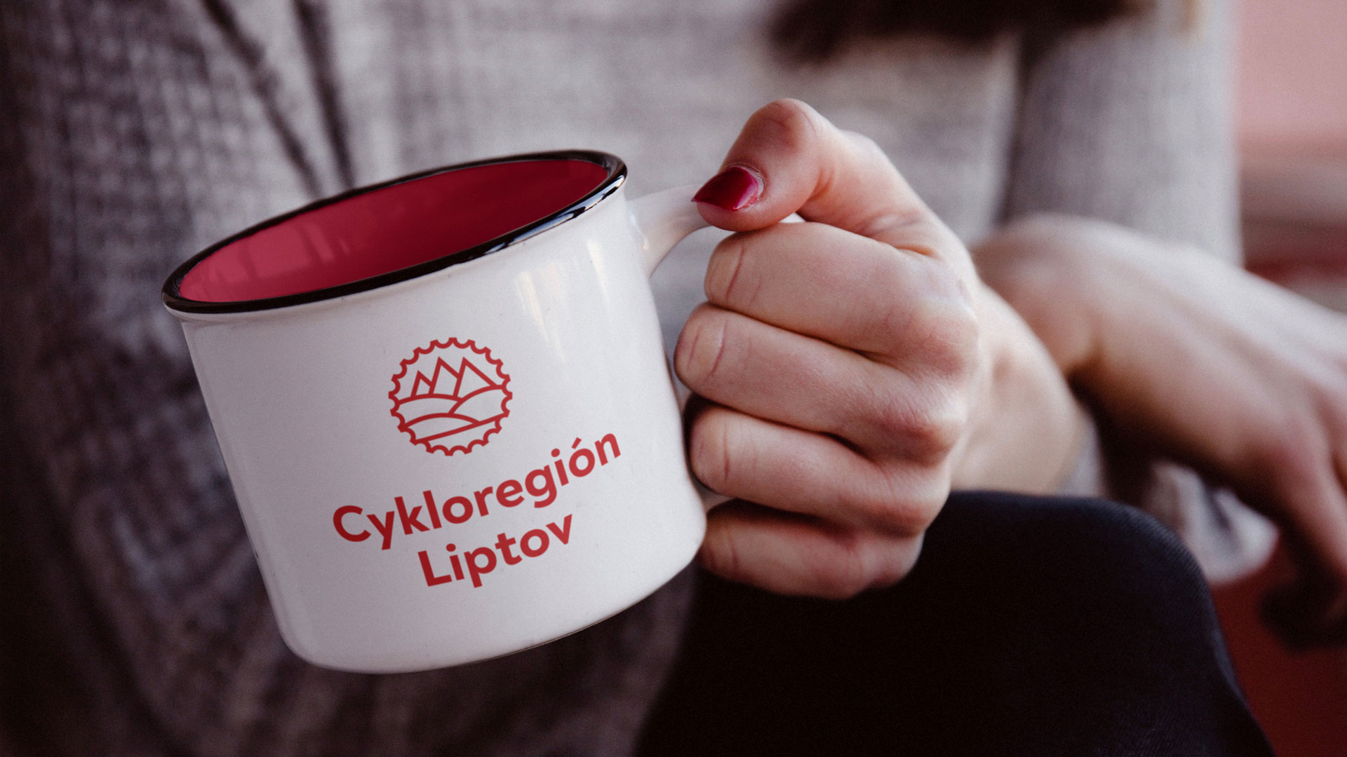
Cykloregión Liptov
The traditional Czech saying goes that good goods praise themselves. We dare to paraphrase it—a good destination praises itself (after all, anyone who has ever visited the marvellous Liptov landscape will certainly agree with us).
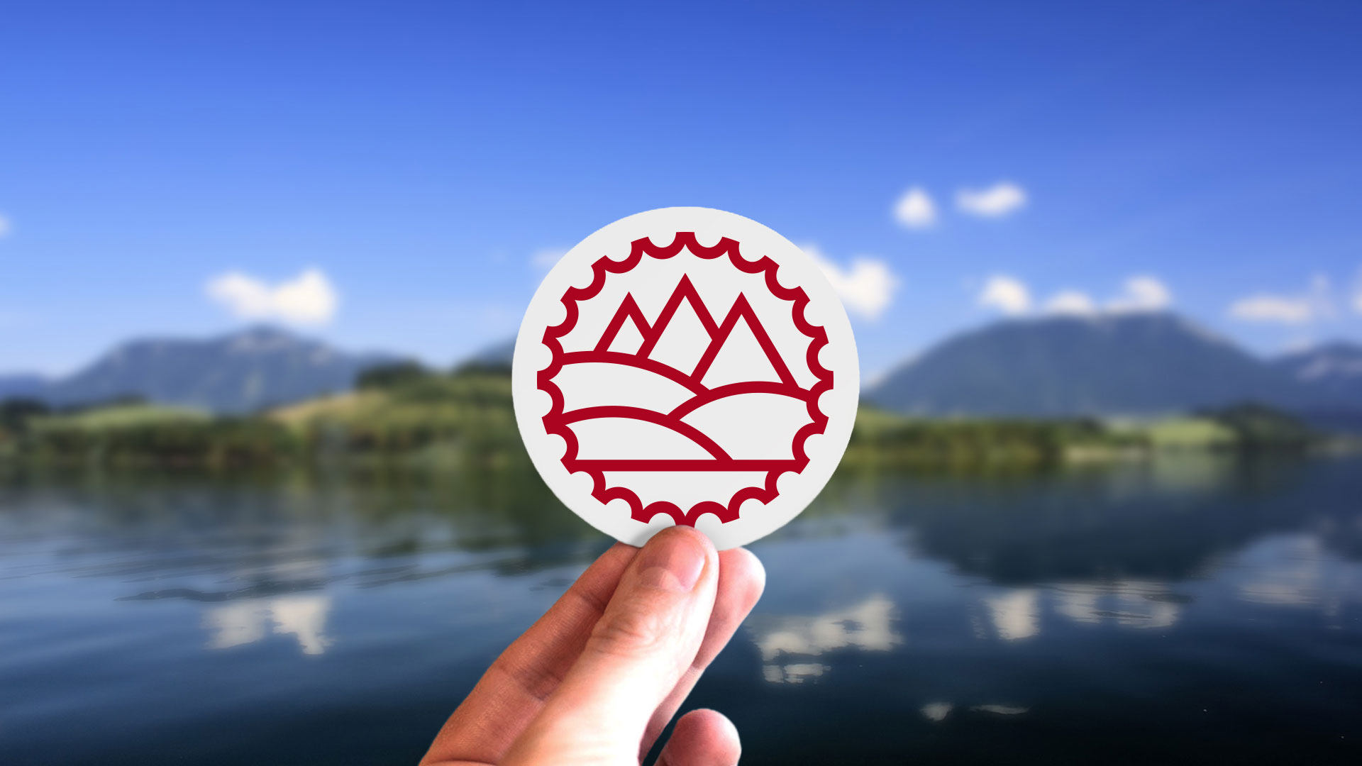
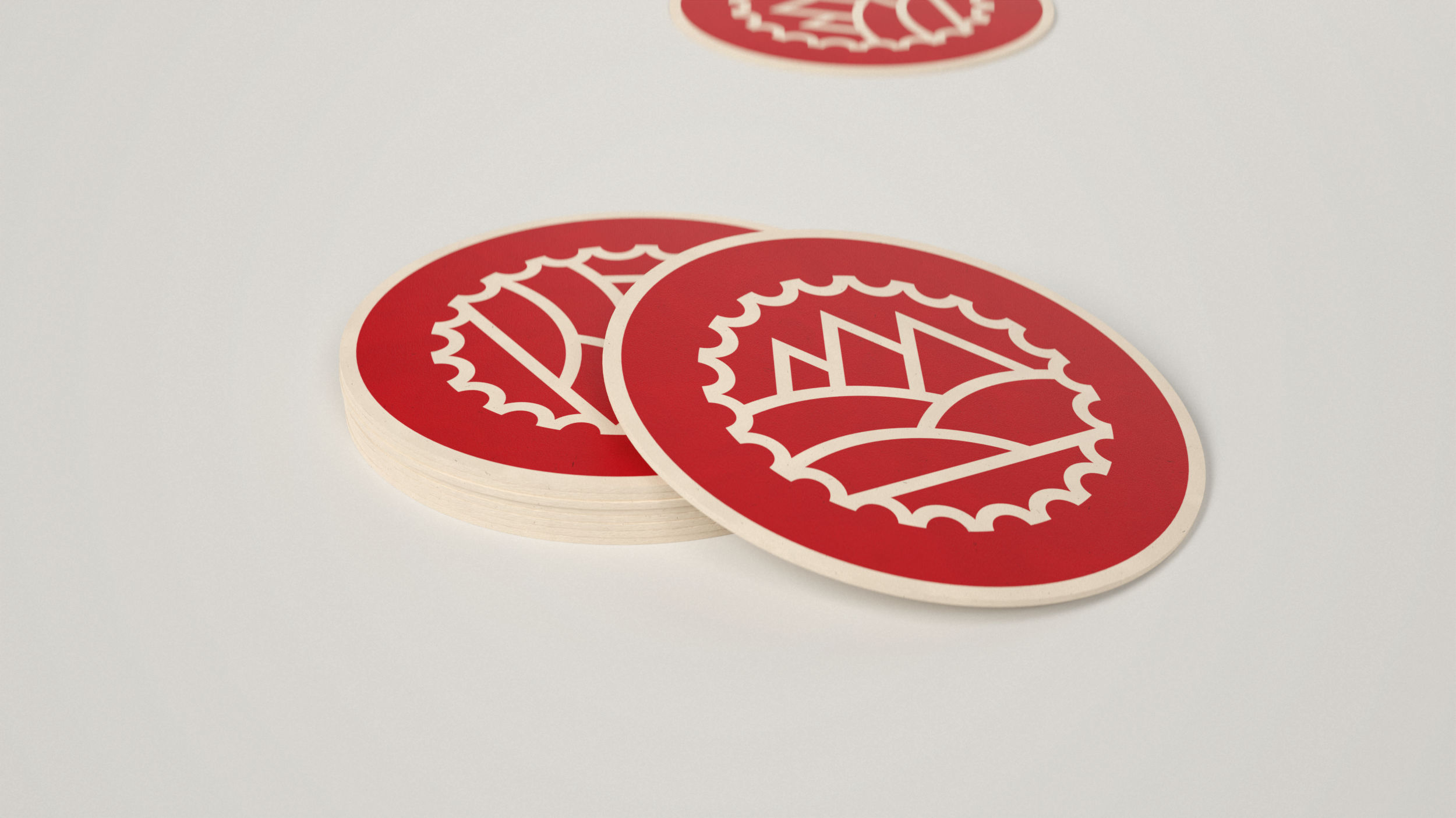
And if Liptov region is lucky enough to have such a picturesque landscape, why not to take advantage of it? We thus based the brand on significant landscape elements of Liptov: the Liptovská Mara reservoir surrounded by a hilly landscape with the Tatra mountains in the background. All this is seen through a cycling prism and in the red color, which directly follows the established destination brand of the Liptov region. Voilà!
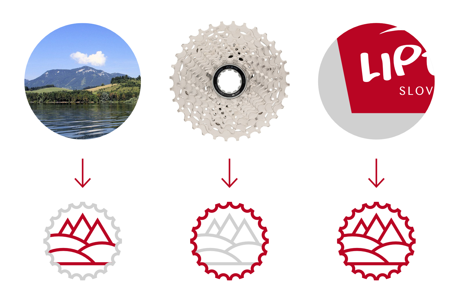
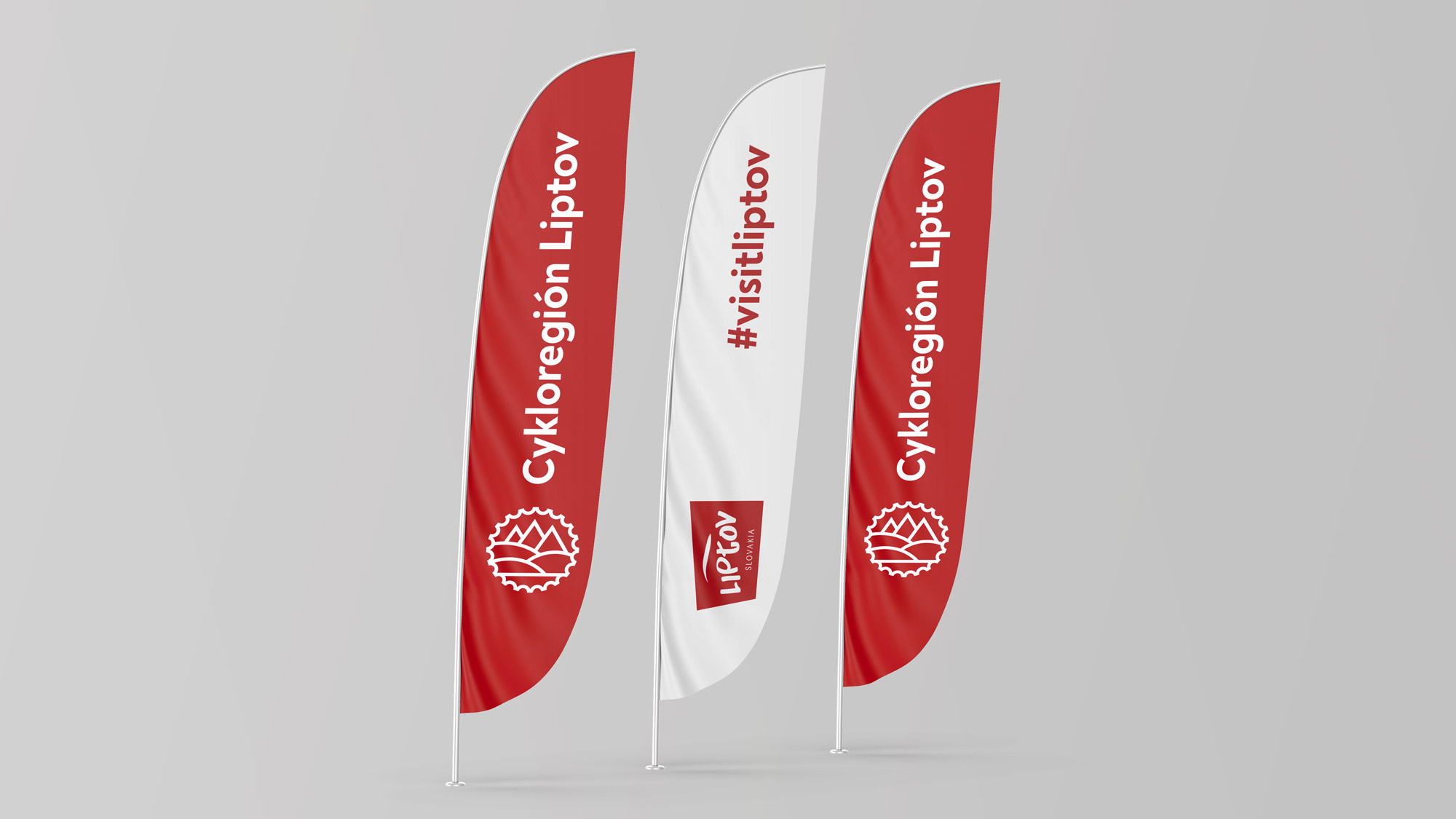
The simplicity of the monolinear drawing of the Liptov landscape enables the seamless application of the brand in the widest range of uses, from social networks to wooden furniture placed on individual cycling routes. In the coming years, the development of the visual identity of the cycloregion in the form of new branding of individual thematic routes is also planned.

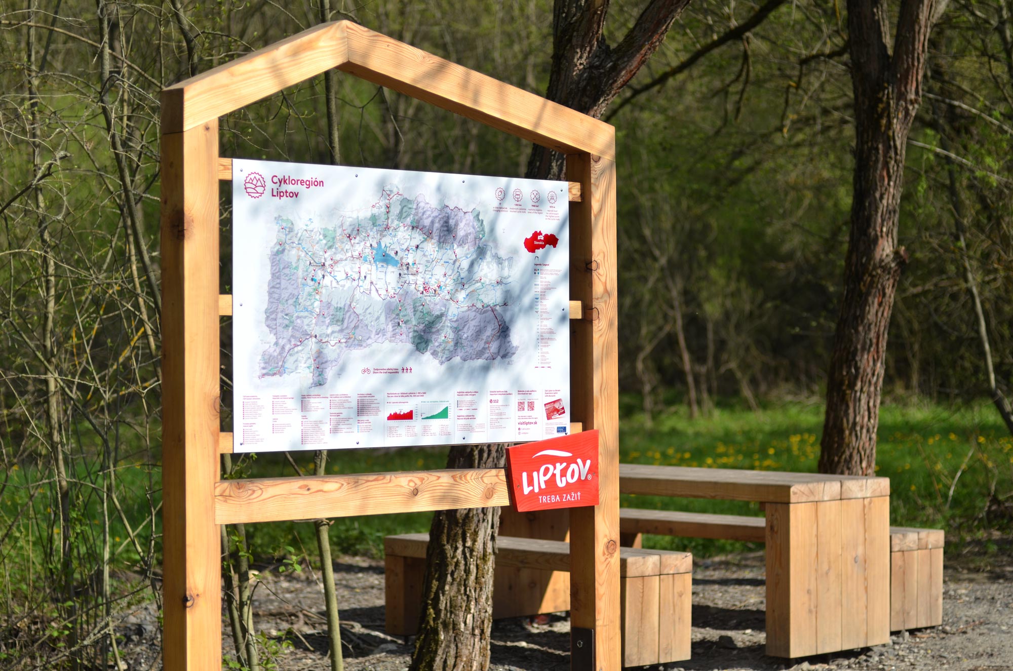
Updating of cycling maps was also part of the project—the main goal was to make them easily legible for fast orientation in the terrain.