Anapur
Just as Anapur itself is a nutritionally balanced combination of 100% natural ingredients, the brand design is a semantic blend of petals referring to organic quality or healthy lifestyle and the three eyes of Annapurna at the ‘summit’ of letter A.
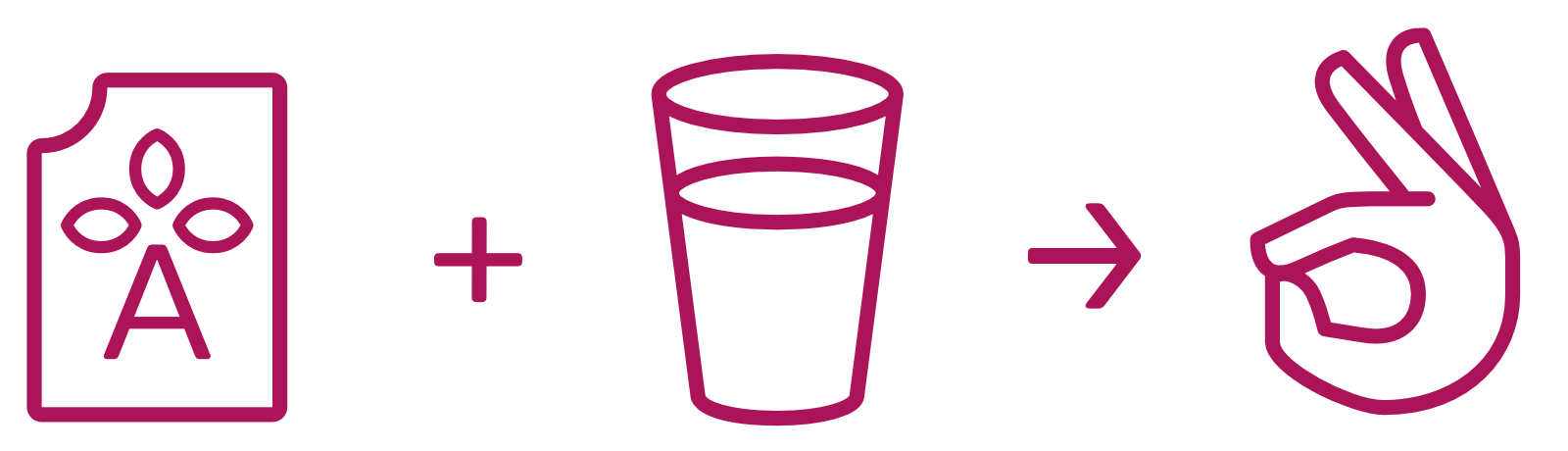
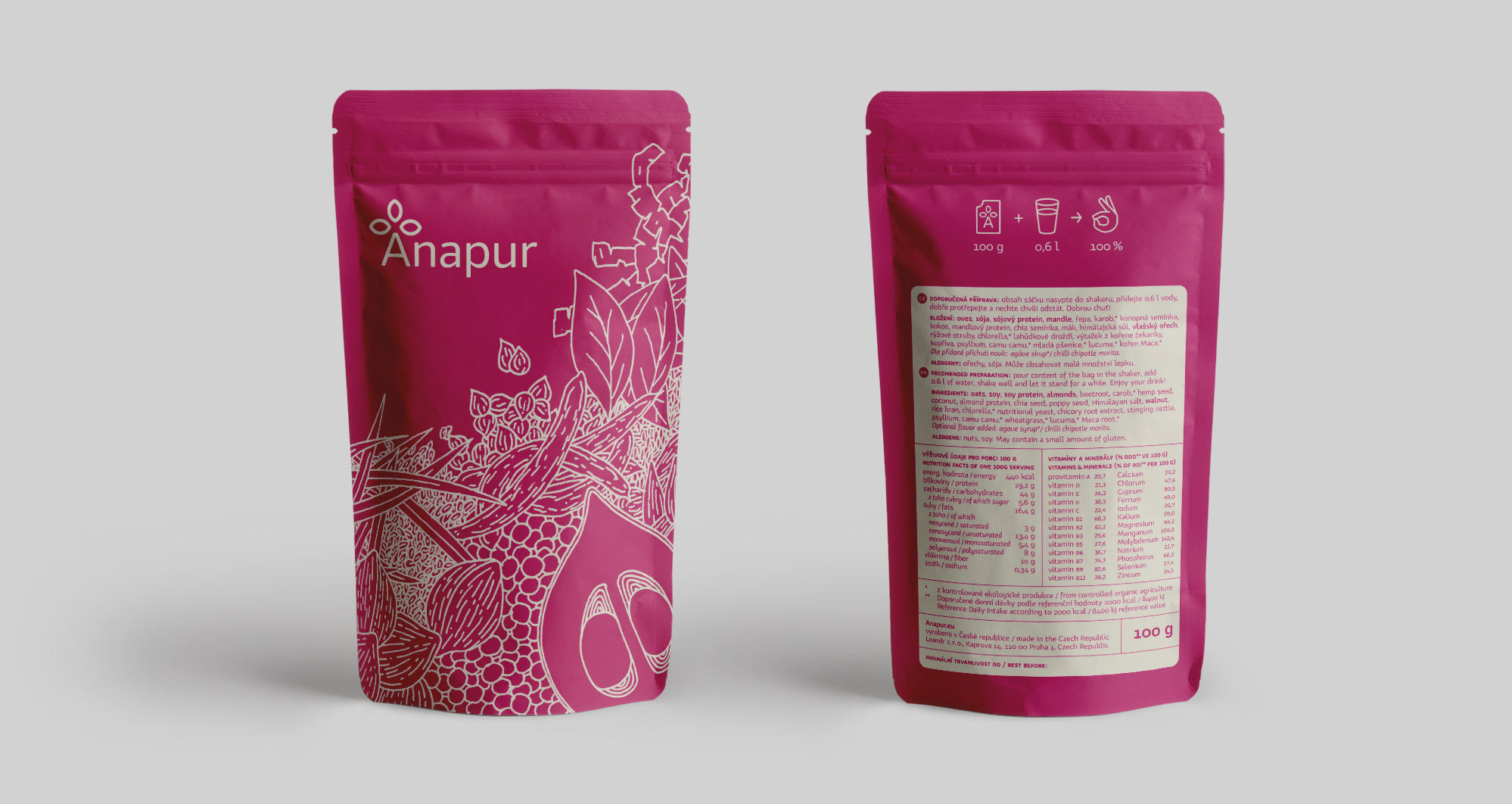
The packaging design of Anapur is based on the drawing of the ingredients that make up the product—at first glance synthetic diet actually consists of 21 vegetable ingredients, which are a natural and healthy source of nutrients, vitamins and minerals.

Our Knedle typeface is used not only in the logotype itself, but also in the following visual style and packaging design. Its rounded stroke endings soften the drawing and add a touch of friendliness to the typeface. The motif of the trefoils in the logotype is created in accordance with the morphology of the typeface, which ensures overall compactness and artistic unity. The use of an identical stroke width also ensures trouble-free legibility even at the maximum allowable reduction.